I read through a few of the other review to make try and keep the grading equal. That is, I want to make sure a D last year is equal to a D this year... does that make sense? Anyways on to the quarters:
 Montana - When I first started grading/reviewing the state quarters I realized that I needed to be fair when it came to states like Kansas and Nebraska, which didn't have easily notable features in their state. I gave Kansas a C because, although they had an okay design, they went entirely generic. The Kansas quarter could have easily passed for the Nebraska or South Dakota quarter. On the other hand the Nebraska quarter took a lesser known feature in the state and made a nice quarter out of it. Well, Montana was one of those states I felt I needed to be extra "fair" with (Although they do have the Roosevelt Arch and, in fact, I'm a little surprise it's not included in the alternates). But I guess they did well going with a bison skull, a landscape and the nickname "Big Sky Country." I like the design and particularly the off-center placement of the nickname. However, like the Kansas quarter, it just isn't unique. But, I still like it and for some reason I like it better than the Kansas quarter. Grade: B
  Washington - Back when I graded Oregon I gave them an A because they used their most prominent natural feature and did it beautifully and simplistically. Well their neighbors to the north have followed suit with their own prominent natural feature, Mount Rainier (which also appears on their license plates). However they decided to add the king salmon jumping out of the water and the state nickname "The Evergreen State." While I don't particularly dislike the addition of the salmon or the nickname, I think the salmon is a little distracting. Overall though a good design.
I would like to point out one of the other finalists for the Washington quarter: A stylized Native America orca. I've got to admit, that design intrigues me. It would certainly been top 10, and I may have even given it the top spot in my upcoming 1-53 countdown (53 now that DC, Guam and Puerto Rico are getting quarters). Alas, Washington went with Rainier and the salmon which will get them the high grade, but because of my previous points will probably rank low among the other states with that grade. Grade: A
 Idaho - The bird you see on the Idaho state quarter is the Peregrine Falcon. Now guess what the state bird of Idaho is? If you said the Peregrine Falcon you would be incorrect! It's actually the Mountain Bluebird. But the Mountain Bluebird seems to be pretty darn boring so Idaho went with its "state raptor", the Peregrine Falcon. Trust me, it doesn't get much better.
Not only is it not their state bird, they picked something that is not unique to Idaho. And while I would love to give Idaho a pass on the "no well-identified feature" point, they actually have a pretty good feature in the Snake River (and the Perrine Bridge). Sure those are not particularly well known features, but neither is the New River Gorge and the New River Bridge and West Virginia pulled it off exceptionally well. (Besides they had a better alternative in the Farmland Tapestry alternative.) Instead they went with the Peregrine Falcon and then made it worse by adding a small outline of the state with a star for the state capital, Boise. Oddly, the only thing I didn't dislike was the motto: "Esto Perpetua". Sadly that wasn't enough to save them from a big fat... Grade: F
 Wyoming - This was probably the hardest quarter to grade because every time I think about the Wyoming quarter I feel differently about it. The biggest problem is that Wyoming just has no excuses. They've got three famous National Park sites in Yellowstone (Old Faithful was one of the alternates), the Grand Tetons and Devil's Tower. But they decided to stay true to their cowboy roots and went with the cowboy on a bucking horse which has appeared on practically every license plates they've released (although their latest license plate also has Devil's Tower on it). So while I commend them for going with their tried and true "logo", unfortunately the featureless logo looks bad as a plain outline on a coin. Finally, I'm not sure if the state nickname, "The Equality State", helps (by adding features) or detracts (by distracting from the lone featureless cowboy). I guess it comes down to me being that bad teacher in school: had Wyoming not had other choices I would have given them a B, however since their bar was set higher, the get a Grade: C
 Utah - Oh Utah! Ye of many national parks! Why would you go with Golden Spike? Or maybe the better question is: why would you go with such a bland depiction of the 1869 meeting at Promontory Summit. The actual meeting seemed much more exciting. So not only is the image boring (and cut off at the bottom!), they forsook a state motto or nickname for the nickname of Salt Lake City, "Crossroads of the West".
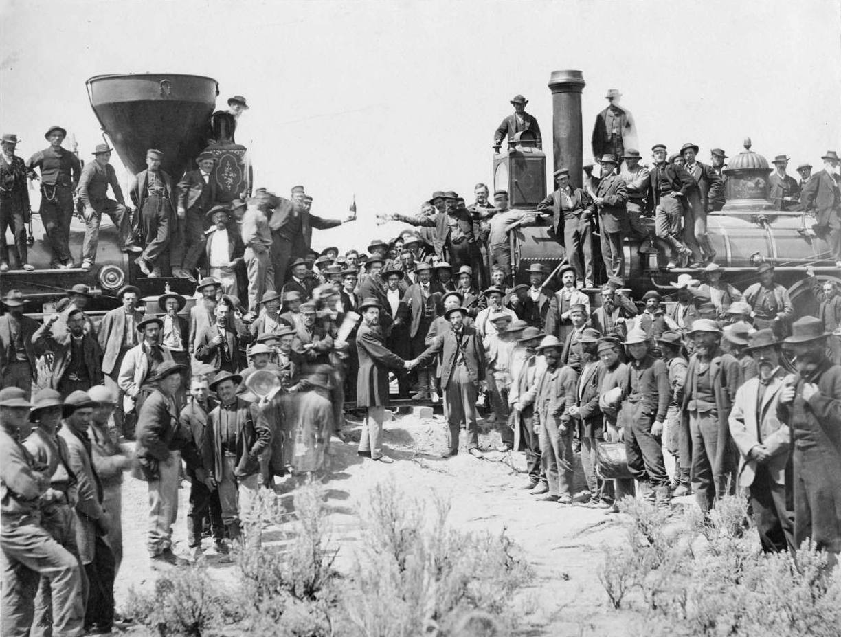
You've lost me, Utah. I don't like it. What makes it all worse is that Utah could have gone with the theme of one of their license plate (Arches National Park or their snow/winter sports) or their seal/state logo (beehive) and easily gotten a B. Oh well, at least the mixed themes (Golden Spike and Salt Lake City) isn't THAT obvious and thus it isn't the worst quarter out there. However, I definitely am feeling generous with the grade. Grade: D