Thursday, August 24, 2006
Tuesday, August 15, 2006
State Quarters 2004: Michigan to Wisconsin
This time no long useless rant... just Quarters!
 Michigan - You've got to hand it to Michigan: They just put their state, the great lakes and "Great Lakes State" on their quarter... and that's it. It's as if the entire state just said, "Eh... Let's not put anything memorable on our quarter." Okay, so that's a little overstating it, especially since the design "Voted #1" (according to QuarterDesign.com) had a bunch of little Michigan "trinkets" on it. But, the Mint must have decided that the trinkets (which included the Model T and the Mackinac Bridge) were too small, not coinable or just looked bad. I would agree with that and considering the other four trinkets were not Michigan specific (a star, a lighthouse, a tree and a canoe), I definitely like that those things were left off. But then the quarter was left looking like an almost featureless map. They probably deserve a C for not ENTIRELY baking the dog on this one, but I'm not feeling charitable... Grade: D
 Florida - Florida is a beautiful place... but it sure is all kinds of messed up. The state is an amalgam of entirely different cultures living in a hot place, kinda like a nicer version of Iraq. You've got the Bible Belt folks in the north and panhandle, who are really south Georgians and Alabamans, along with the younger, hipper types in the more densely populated south and along the coasts. (Not to mention all the retirees scatter throughout.)
The state is a mess, so it should come as no surprise that their quarter is a mess as well. They've got a spanish galleon, the space shuttle and a beach with palm trees. Doesn't make a lot of sense until they add the "Gateway to Discovery" motto. But then that doesn't make much sense either because, if Florida is the gateway to North America (something it IS part of) how can it also be the gateway to space (something it's not part of). Plus the design is horrible, with out of proportion subjects and too much white space. Good try Florida, but NO that's not gonna fly! You should have just gone with the Everglades or St. Augustine quarter... Grade: D
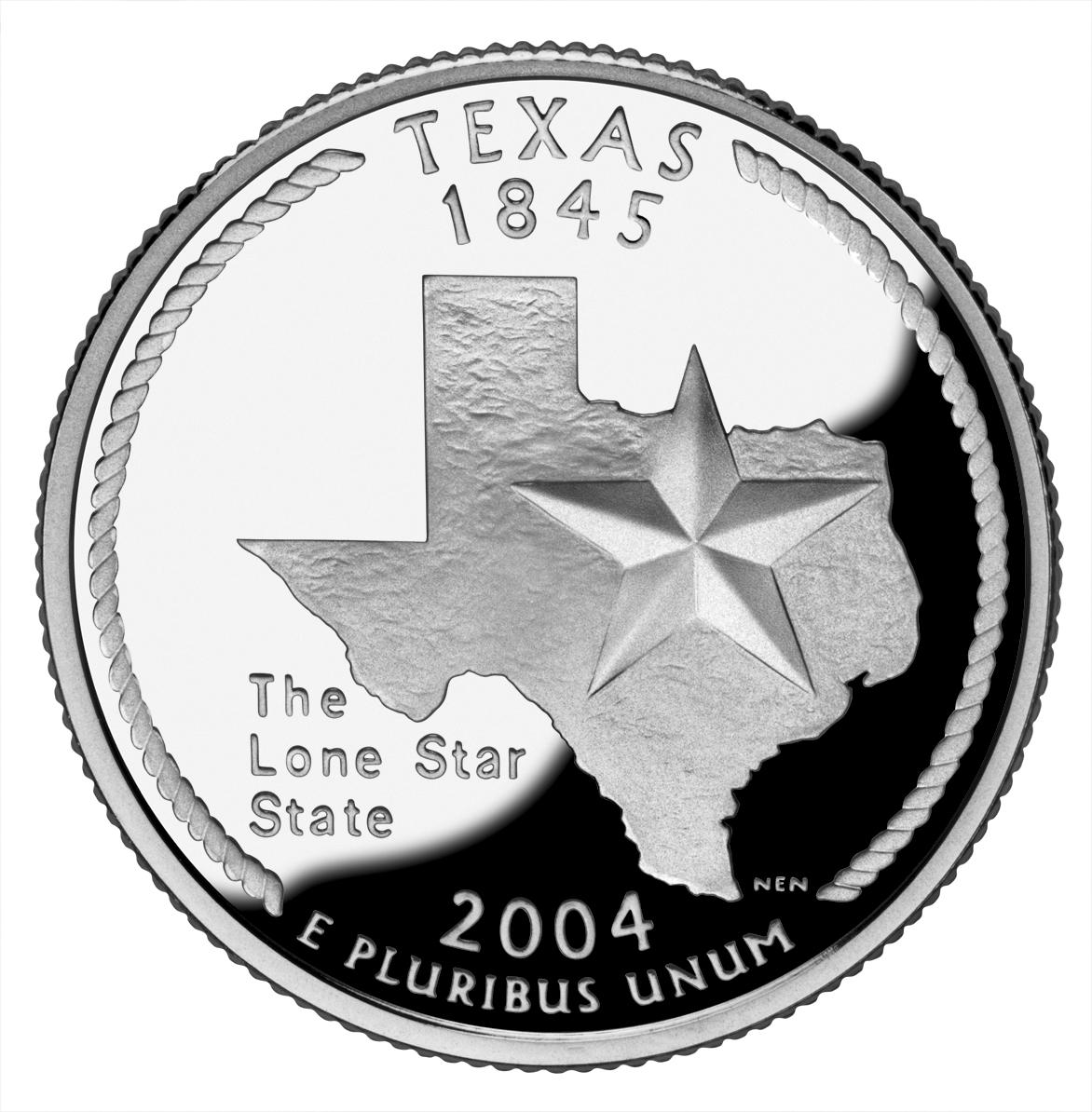
 Texas - I've got to admit, I've never been much of a fan of Texas. I just don't like the whole "Don't mess with Texas" ideal (and, yes, I know it's an anti-littering campaign, but its also a "better than you" attitude). And that's strange because, I've liked practically everyone I've met from Texas and I've enjoyed myself each time I have visited. So I'm on the fence with Texas... and their quarter. First a couple of things I like: I REALLY like that a rope was used on the edge, which is very reminiscent of cowboy's lasso. I also liked that Texas didn't feel the need to throw a crapload of things on their quarter. They just went with the "Lone Star" and their very recognizable state outline (probably the only time I can condone it's use). However, I really don't like the font used for the text "The Lone Star State" which makes it stick out horribly. And I would rather something more interesting than just a star and an outline, but it's not awful. Grade: C
 Iowa - I like Iowa for all the reasons I don't like Texas. They are a fairly unassuming state and, of whom I've met, people. So really, I wanted them to do well with their quarter... and they did... sort of. Not having much in the way of memorable monuments and natural features (aside from their farms and rolling hills) they used a painting, Arbor Day, by Iowan Grant Wood for their design. Pretty darn smart, for a few reasons. First, since anything they used (a farm, a field, a schoolhouse, etc.) would most likely lack a unique Iowan theme, they connected it to Iowa by using a painting by Grant Wood. Second, in using Wood's painting they borrowed his distinct style, which was captured especially well in the hills on the quarter. What knocks the design down a few notches, is the lack of smooth area on the quarter, since the "painting" takes up most of the quarter. The other thing that was annoying was the "Foundations in Education" text which looks like it was shoved into the space between "1846" text and the schoolhouse. Now, granted, Iowa has reason to be proud of their history of education (you can read more in the link at the beginning of this paragraph) but the text messes with the balance and simplicity of the design. They should have stopped while they were ahead. Finally, and I've said this before, cutting off the design at the bottom simply looks bad. Sure, it's an interpretation of a painting, but it's not an actual painting... its a coin. Well, at least the harsh line is tempered by the "Grant Wood" text, but that and all the other positives can't bring it up to the ultimate grade. Grade: B
 Wisconsin - If you read the U.S. Mint's quarter pages (I link to them from the state name), you'll notice how the Mint really stretches it when explaining the features on some quarters (like Arkansas's creek, duck and rice ). Wisconsin's ear of corn (which caused a bit of news on it's own if you remember) is one of those overexplained features. Sure, Wisconsin makes a lot of corn (they lead the nation in "corn silage production" but not "corn for grain", whatever that means) but corn is certainly not unique to Wisconsin. So placing it on the quarter is a stretch. I can see how the cow and cheese relate, but in essence they both represent the same thing, dairy. Which wouldn't be all that bad had they not put the ear of corn in there. So really the only thing I like is how they "enhanced" the text, Wisconsin's state motto: "Forward", by placing it on a banner. Well, good for you, Wisconsin! But your quarter is mediocre. Grade: C
 Michigan - You've got to hand it to Michigan: They just put their state, the great lakes and "Great Lakes State" on their quarter... and that's it. It's as if the entire state just said, "Eh... Let's not put anything memorable on our quarter." Okay, so that's a little overstating it, especially since the design "Voted #1" (according to QuarterDesign.com) had a bunch of little Michigan "trinkets" on it. But, the Mint must have decided that the trinkets (which included the Model T and the Mackinac Bridge) were too small, not coinable or just looked bad. I would agree with that and considering the other four trinkets were not Michigan specific (a star, a lighthouse, a tree and a canoe), I definitely like that those things were left off. But then the quarter was left looking like an almost featureless map. They probably deserve a C for not ENTIRELY baking the dog on this one, but I'm not feeling charitable... Grade: D
 Florida - Florida is a beautiful place... but it sure is all kinds of messed up. The state is an amalgam of entirely different cultures living in a hot place, kinda like a nicer version of Iraq. You've got the Bible Belt folks in the north and panhandle, who are really south Georgians and Alabamans, along with the younger, hipper types in the more densely populated south and along the coasts. (Not to mention all the retirees scatter throughout.)
 The state is a mess, so it should come as no surprise that their quarter is a mess as well. They've got a spanish galleon, the space shuttle and a beach with palm trees. Doesn't make a lot of sense until they add the "Gateway to Discovery" motto. But then that doesn't make much sense either because, if Florida is the gateway to North America (something it IS part of) how can it also be the gateway to space (something it's not part of). Plus the design is horrible, with out of proportion subjects and too much white space. Good try Florida, but NO that's not gonna fly! You should have just gone with the Everglades or St. Augustine quarter... Grade: D
 Texas - I've got to admit, I've never been much of a fan of Texas. I just don't like the whole "Don't mess with Texas" ideal (and, yes, I know it's an anti-littering campaign, but its also a "better than you" attitude). And that's strange because, I've liked practically everyone I've met from Texas and I've enjoyed myself each time I have visited. So I'm on the fence with Texas... and their quarter. First a couple of things I like: I REALLY like that a rope was used on the edge, which is very reminiscent of cowboy's lasso. I also liked that Texas didn't feel the need to throw a crapload of things on their quarter. They just went with the "Lone Star" and their very recognizable state outline (probably the only time I can condone it's use). However, I really don't like the font used for the text "The Lone Star State" which makes it stick out horribly. And I would rather something more interesting than just a star and an outline, but it's not awful. Grade: C
 Iowa - I like Iowa for all the reasons I don't like Texas. They are a fairly unassuming state and, of whom I've met, people. So really, I wanted them to do well with their quarter... and they did... sort of. Not having much in the way of memorable monuments and natural features (aside from their farms and rolling hills) they used a painting, Arbor Day, by Iowan Grant Wood for their design. Pretty darn smart, for a few reasons. First, since anything they used (a farm, a field, a schoolhouse, etc.) would most likely lack a unique Iowan theme, they connected it to Iowa by using a painting by Grant Wood. Second, in using Wood's painting they borrowed his distinct style, which was captured especially well in the hills on the quarter. What knocks the design down a few notches, is the lack of smooth area on the quarter, since the "painting" takes up most of the quarter. The other thing that was annoying was the "Foundations in Education" text which looks like it was shoved into the space between "1846" text and the schoolhouse. Now, granted, Iowa has reason to be proud of their history of education (you can read more in the link at the beginning of this paragraph) but the text messes with the balance and simplicity of the design. They should have stopped while they were ahead. Finally, and I've said this before, cutting off the design at the bottom simply looks bad. Sure, it's an interpretation of a painting, but it's not an actual painting... its a coin. Well, at least the harsh line is tempered by the "Grant Wood" text, but that and all the other positives can't bring it up to the ultimate grade. Grade: B
 Wisconsin - If you read the U.S. Mint's quarter pages (I link to them from the state name), you'll notice how the Mint really stretches it when explaining the features on some quarters (like Arkansas's creek, duck and rice ). Wisconsin's ear of corn (which caused a bit of news on it's own if you remember) is one of those overexplained features. Sure, Wisconsin makes a lot of corn (they lead the nation in "corn silage production" but not "corn for grain", whatever that means) but corn is certainly not unique to Wisconsin. So placing it on the quarter is a stretch. I can see how the cow and cheese relate, but in essence they both represent the same thing, dairy. Which wouldn't be all that bad had they not put the ear of corn in there. So really the only thing I like is how they "enhanced" the text, Wisconsin's state motto: "Forward", by placing it on a banner. Well, good for you, Wisconsin! But your quarter is mediocre. Grade: C
Sunday, August 06, 2006
State Quarters 2003: Illinois to Arkansas
Two things: First, I'm obviously stupid for not knowing (or at least not looking it up) that the state nickname of Indianapolis actually IS "Crossroads of America." Second, I'm well aware that the individual states did not actually pick the designs on their quarters. Each state submitted designs to the U.S. Mint and the Mint, not the state, made the final choice and design. So my picking on the states might seem a bit misguided, but I think I have a good reason for putting the blame or praise on the states. First, any fault in subject is obviously the states fault... since they picked the subject (like South Carolina deciding to see how many different things they could fit on the quarter). The other issue would be a "bad design" issue, in that the design submitted came out different when implemented. But this should also be the states fault, since it shouldn't take too much work or money to have a numismatician tell you if the design you're submitting will work or not. (See the next paragraph) So anyways, as the radio stations back in the 80s used to say: "More Rock... Less Talk!"
 Illinois - If I had a time machine, I would go back in time and change a few things. (Actually, I wouldn't... but go ahead and play with me for a bit.) Among the least important things I would set out to do, would be to go back to 2001or 2002 and start a campaign to keep Illinois from making the disaster of coin that they did. An absolute train crash of a coin, this is a good example of a not so bad idea gone horribly awry. Illinois submitted a coin design that looked good on paper, but just doesn't work on a coin. First, the shadowed city and farm skyline doesn't translate to a coin. Second, the beveled edge to the state outline would make it hard to put Lincoln (and another layer of depth) on top of the outline. Finally, the statue of Lincoln is just too small to make out well. So they used really boring outlines for the skylines and made things worse by not having them level (the farm is higher than Chicago). Then they blew up/zoomed in on Lincoln and cut him off with that ugly state outline, which made it look like he was missing his right leg and left foot. And the icing? Using one of the state nickname (Land of Lincoln) and a bad wordplay (21st State/Century). Grade: F
 Alabama - Remember that kid in school who tried hard and never got an A, at least not with a good teacher? The bad teachers would give them an A, just to make them feel better, but really they deserved a C or sometimes a B. You did your homework in the class right before that one and they complained about spending three hours on it the previous night. Well that's how I feel about Alabama's quarter. (Or really that's how Mississippi should feel about Alabama.) However, the home of Forrest Gump gave it a good try. I definitely like that they went with Helen Keller and that they were daring enough to depict her reading a book. I don't think I need to point out, though, that an image of someone reading a book is pretty boring. I also like her name in braille on the quarter and putting the text "Spirit and Courage" on a banner. But they really threw the balance off on the coin by putting her in a chair and also by using two entirely different plants (longleaf pine and magnolia) along the edge. Cutting off Keller's legs doesn't help either, but that almost became a necessity after placing her in a chair. Anyways, I'm very torn by this coin and this is definitely one of those middle grade coins (smack dab between a B and a C). I'm feeling charitable though... much like that not so good teacher. Grade: B
 Maine - There are 10 U.S. states I have never laid foot on. (In fact, Here is a map of the States I have visited... The grey states have not had the pleasure of me.) If I had to list them from "Most want to visit" to "Least want to visit", Maine would be competing with Colorado for 3rd place. (BTW, Alaska, Hawaii, Maine/Colorado, Michigan, Missouri, North Dakota, Oklahoma and Kansas would be the list.) That might not sound like much, but trust me, it is. I have always liked Maine because I have this idealized view of it as an easy-going and unassuming state. Maine's quarter certainly upholds this notion. It is a very simple and elegant image of a schooner and the Pemaquid Point Lighthouse. The rather random schooner (a generic sailboat would have sufficed) might have touches of subtle pretentiousness, but that is tempered by the lack of a tacky slogan or nickname. Maine wisely left off "Vacationland" (which is fine for a license plate, but not a quarter) and "The Pine Tree State" from their quarter. In all, a very good design but among the lesser quarters in this grade... Grade: A
 Missouri - Remember how I started this post by mentioning that the states submitted "design ideas" to the U.S. Mint, but ultimately, it was the Mint that designed the quarter? Well, apparently, this didn't sit well with the guy who made the original design for the Missouri quarter. He claims that the Mint said his coin was not coinable and that his design was then "dumbed down." He even had a private mint coin his design and now he calls the whole debacle "Quartergate." Well, I hate to break it to him, but his design was hardly any better (you can see the private mint coin from that link). The shadow (of the trees and boat), although an admirable idea, looks terrible with that big line through the middle of the quarter. The text in the trees just makes everything worse, by making it hard to recognize that those things are trees. His design has the same problem as the final one in that the Gateway Arch seems to span the Mississippi River. The only, thing that looks better in the original is the boat. The final designs boat looks like a big carved stone but at least the trees look more like trees. Either way, the original design was bad and the final implementation was bad... no matter how you look at, it's just not a good design. Grade: D
 Arkansas - What do diamonds, rice, a lake and a duck have in common? Arkansas, of course! (I think you can tell where this is going...) I'll start by commending Arkansas who, like Maine, decided not to put any slogan, nickname or motto on their quarter... unfortunately that's where the praise ends. The most egregious items on this quarter have to be the lake, the duck and rice. I mean, really, who doesn't have lakes and ducks and why would they be special to Arkansas? And isn't rice grown throughout the south? And it's such a shame because Arkansas is a beautiful place which deserves the nickname "The Natural State" since almost ever interesting attraction the state has is a natural attraction. Hot Springs National Park is an awesome place. Crater of Diamonds might be the only diamond mine open to the public. So they really dropped the ball on this one by stuffing 4 things, 3 of which could hardly be identified, in any unique sense, to the state. Grade: F
Subscribe to:
Comments (Atom)