 Michigan - You've got to hand it to Michigan: They just put their state, the great lakes and "Great Lakes State" on their quarter... and that's it. It's as if the entire state just said, "Eh... Let's not put anything memorable on our quarter." Okay, so that's a little overstating it, especially since the design "Voted #1" (according to QuarterDesign.com) had a bunch of little Michigan "trinkets" on it. But, the Mint must have decided that the trinkets (which included the Model T and the Mackinac Bridge) were too small, not coinable or just looked bad. I would agree with that and considering the other four trinkets were not Michigan specific (a star, a lighthouse, a tree and a canoe), I definitely like that those things were left off. But then the quarter was left looking like an almost featureless map. They probably deserve a C for not ENTIRELY baking the dog on this one, but I'm not feeling charitable... Grade: D
 Florida - Florida is a beautiful place... but it sure is all kinds of messed up. The state is an amalgam of entirely different cultures living in a hot place, kinda like a nicer version of Iraq. You've got the Bible Belt folks in the north and panhandle, who are really south Georgians and Alabamans, along with the younger, hipper types in the more densely populated south and along the coasts. (Not to mention all the retirees scatter throughout.)
 The state is a mess, so it should come as no surprise that their quarter is a mess as well. They've got a spanish galleon, the space shuttle and a beach with palm trees. Doesn't make a lot of sense until they add the "Gateway to Discovery" motto. But then that doesn't make much sense either because, if Florida is the gateway to North America (something it IS part of) how can it also be the gateway to space (something it's not part of). Plus the design is horrible, with out of proportion subjects and too much white space. Good try Florida, but NO that's not gonna fly! You should have just gone with the Everglades or St. Augustine quarter... Grade: D
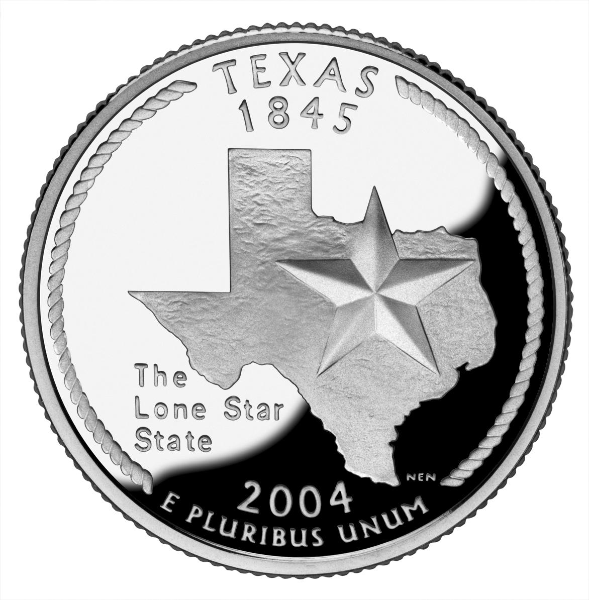 Texas - I've got to admit, I've never been much of a fan of Texas. I just don't like the whole "Don't mess with Texas" ideal (and, yes, I know it's an anti-littering campaign, but its also a "better than you" attitude). And that's strange because, I've liked practically everyone I've met from Texas and I've enjoyed myself each time I have visited. So I'm on the fence with Texas... and their quarter. First a couple of things I like: I REALLY like that a rope was used on the edge, which is very reminiscent of cowboy's lasso. I also liked that Texas didn't feel the need to throw a crapload of things on their quarter. They just went with the "Lone Star" and their very recognizable state outline (probably the only time I can condone it's use). However, I really don't like the font used for the text "The Lone Star State" which makes it stick out horribly. And I would rather something more interesting than just a star and an outline, but it's not awful. Grade: C
 Iowa - I like Iowa for all the reasons I don't like Texas. They are a fairly unassuming state and, of whom I've met, people. So really, I wanted them to do well with their quarter... and they did... sort of. Not having much in the way of memorable monuments and natural features (aside from their farms and rolling hills) they used a painting, Arbor Day, by Iowan Grant Wood for their design. Pretty darn smart, for a few reasons. First, since anything they used (a farm, a field, a schoolhouse, etc.) would most likely lack a unique Iowan theme, they connected it to Iowa by using a painting by Grant Wood. Second, in using Wood's painting they borrowed his distinct style, which was captured especially well in the hills on the quarter. What knocks the design down a few notches, is the lack of smooth area on the quarter, since the "painting" takes up most of the quarter. The other thing that was annoying was the "Foundations in Education" text which looks like it was shoved into the space between "1846" text and the schoolhouse. Now, granted, Iowa has reason to be proud of their history of education (you can read more in the link at the beginning of this paragraph) but the text messes with the balance and simplicity of the design. They should have stopped while they were ahead. Finally, and I've said this before, cutting off the design at the bottom simply looks bad. Sure, it's an interpretation of a painting, but it's not an actual painting... its a coin. Well, at least the harsh line is tempered by the "Grant Wood" text, but that and all the other positives can't bring it up to the ultimate grade. Grade: B
 Wisconsin - If you read the U.S. Mint's quarter pages (I link to them from the state name), you'll notice how the Mint really stretches it when explaining the features on some quarters (like Arkansas's creek, duck and rice ). Wisconsin's ear of corn (which caused a bit of news on it's own if you remember) is one of those overexplained features. Sure, Wisconsin makes a lot of corn (they lead the nation in "corn silage production" but not "corn for grain", whatever that means) but corn is certainly not unique to Wisconsin. So placing it on the quarter is a stretch. I can see how the cow and cheese relate, but in essence they both represent the same thing, dairy. Which wouldn't be all that bad had they not put the ear of corn in there. So really the only thing I like is how they "enhanced" the text, Wisconsin's state motto: "Forward", by placing it on a banner. Well, good for you, Wisconsin! But your quarter is mediocre. Grade: C
1 comment:
Интересная мысль, возьму на заметку.
Post a Comment