I ended up doing pretty well in the "Top Half" of my bracket, correctly predicting all the qualifying teams from groups A through D. I got groups A and B exactly and Groups C and D backwards (although pointswise there was a tie at the top of group C). Since the winner of groups C and D play each other I don't have to re-pick those because the same teams will be playing each other. The biggest surprise to me was how well Portugal played, living up to their runner up position at Euro 2004 and a marked improvement over their last world cup. I still have them beating the Netherlands but I was slightly surprised by the Oranje's play as well. Although I am more interested in the Argentina-Mexico match, the Portugal-Netherlands match should be awesome. The other two games are/were easy to call as Germany already beat Sweden 2-0 and England should be able to handle Ecuador.
The Groups E through H were a slightly different story. All my first place teams (Italy, Brazil, France and Spain) qualified, although France finished second in their group. Conversely, all my second place teams (U.S., Croatia, South Korea and Tunisia) failed to qualify with Ghana, Australia, Ukraine and Switzerland (who finished first in their group) qualifying. So, I'll stick with my top picks to win: Brazil over Ghana, with the Ghanans finally having a taste of a real offense in Brazil. Italy over Australia, with the Australians giving, a weaker than I expected, Italy a good game. Spain over France, in a game that should be a lot harder than it looks for the Spanish who breezed through the group rounds against subpar competition. Finally in the game I totally missed, I'll predict what should be the EASIEST game of the round of 16 (and that takes into account Germany's cakewalk against Sweden today) for Switzerland against Ukraine.
Saturday, June 24, 2006
Wednesday, June 21, 2006
State Quarters Design Review: 2001 (New York to Kentucky)
A note on my grading: When I stated grading the coins I used +/- to distinguish between coins that were pretty close. I'm stopping that now because it makes me overthink the grades especially when comparing coins (and I'm going back to change Georgia from a A- to a B). This will make things a bit hard because there will be a few coins (like today's North Carolina and Rhode Island) that I'll want to rank inbetween grades. So to make things easier to understand here are my grade explanations: A - An outstanding excellent coin. B - A great to very good coin, that for one small reason or another just couldn't be an A. C - A very good to good coin that has some issues. D A sub par coin that could have been done better. F - just a bad design all around. In the end, to better differentiate between coins, I'll just rank them straight up 1-40. So, anyways, here are the quarters of 2001:
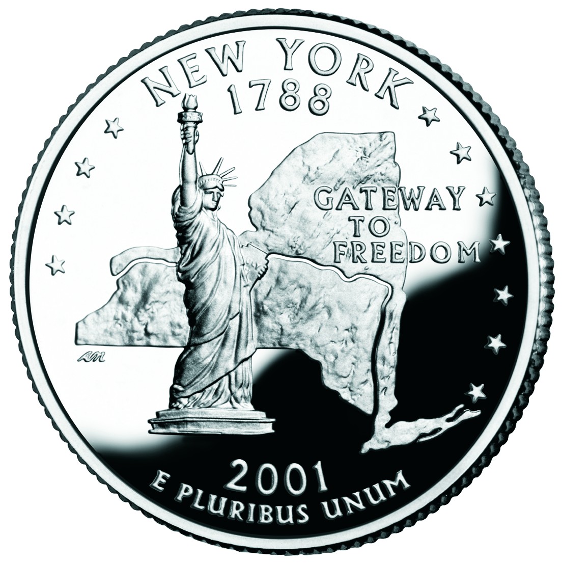
 New York - New York played it safe and went with a full body view of Statue of Liberty. I'm not saying it's a bad choice but its clichéd. I might have gone with Niagara Falls, the Empire state building (considering they're the Empire State) or something else. But I guess it was better to go the "safe route" then the entirely obscure route (Victory at Saratoga? Did they mean the Travers Stakes at the race track?) Also, they fortunately, or unfortunately depending on how you see it, didn't go with the World Trade Center Towers, which were knocked down about 9 months after the coin was released. So with another statue on a quarter, this coin ends up looking like a blatant rip-off of the Massachusetts coin (granted, with a much better known statue). The layout, however, is worse as the text is slightly muddled by the state map (at least they didn't use an outline). I like that the Hudson River and Erie Canal are shown and I also like the phrase "Gateway to Freedom" which is a nice change from an overused state nickname. Grade: C
 North Carolina - I like that North Carolina didn't play around. They were either going with "First in Flight" or the Hatteras Lighthouse. They went with the same design as their license plate, and I think they did well. However, they made the same mistake as Virginia. Instead of designing for a coin it looks like they made a design and then "cut" it into the coin, as both have a harsh line drawn at the bottom of the design. A few other states (West Virginia, Iowa) did the same thing and I think it just doesn't look good. (Actually, the next few coins give a good example of how to "end" a design on a coin.) But besides that one problem, I like the North Carolina quarter. I'ld even grade it higher if it were a bit more original. Grade: B
 Rhode Island - Last week I talked about how Connecticut could have gone with a sailing coin had they not done the Charter Oak quarter. If they had, they would have beaten Rhode Island to the "sailing" quarter simply by virtue of ratified the Constitution two years earlier (btw, Rhode Island was the last of the original 13 states to join the Union). Maryland could have also laid claim to the "sailing" quarter (ratifying a month after Connecticut) but in the end things worked out just fine... especially considering Rhode Island's nickname is "The Ocean State." So along with the sailboat, Rhode Island used the Newport Bridge and the state nickname in a very nice design. And as I mentioned earlier, Rhode Island's design perfectly avoids a straight line to define the end of the design (water). Grade: A
 Vermont - I'm not sure if there is a rule against using things along state borders, like Lake Champlain between New York and Vermont. Not that Lake Champlain would have been better then a guy collecting maple syrup sap though. Oh and tucked away behind the dude and the trees is Camel's Hump Mountain, which I wouldn't have known had I not looked it up. In all, a very good coin but basically a regular coin. But at least they did two obvious things which saved it from being a bad quarter: First they didn't end the design by "cutting it" along the bottom. Second, they were creative enough to use the phrase "Freedom and Unity." Not that I'm against state nicknames, but in this case their nickname is pretty obvious (especially if you speak french): "The Green Mountain State." So we'll give Vermont a middle of the road grade. Grade: C
 Kentucky - I should say that I like Vermont and Kentucky's quarters, it's just that they are average coins. They both went with things they are really known for (which coins like MA and VA missed on) so I feel bad giving them middle of the road... but I promise to rank them higher than those coins in the final ranking. Their problem is that they picked rather calm scenes that would have looked much better on a photo or travel poster. Kentucky went with a thoroughbred and another entity which requires looking up: The Federal Hill Mansion which looks like any other home/mansion. But, like Vermont, Kentucky should get points for not ending the design by "cutting it" at the bottom and for using "My Old Kentucky Home." (Although, that makes for a weird happening in that "Kentucky" appears twice on the quarter.) Finally, the alternate/proposed designs weren't any better in Kentucky's case, but I would have gone with a depiction of either Mammoth Cave or the stretch run of the Kentucky Derby. Grade: C
Next Time: Tennessee, Ohio, Louisiana, Indiana, and Mississippi
Friday, June 16, 2006
State Quarters Design Review: 2000 (Massachusetts to Virginia)
Today, I'll continue my review of the U.S. state quarters. One quick link: Although I indirectly linked to it yesterday (for the alternate Delaware designs) I didn't link directly to the main page on this pretty cool site of alternate quarter designs. So, without further ado:
 Massachusetts - I am not entirely resolved as to how I feel about the Massachussett quarter. In a pure layout design sense it's near perfect: the offset Minuteman statue and the text ("The Bay State") fit around the state perfectly and take up their respective spaces perfectly. Feature-wise it's pretty boring, though. The filled-in outline of the state is definitely better than the thin outline, but it's still pretty plain. That leaves the statue as the only attracting feature which makes it barely better than the Pennsylvania quarter. (Remember that full length statues don't make good coin subjects) In fact, I would have gone with the Boston Light design but I would have filled in the spaces around the lighthouse with text, ala Delaware and Cesar Romney. Not great but definitely better. Grade: C
 Maryland - I should admit that I'm probably biased here since I associates myself with Maryland. But I like the Maryland quarter. I think the Maryland quarter is good. I just can't get it out of my head that it could have been better. They did well by placing plants (The White Oak in this case) on the edges (like Georgia), but I'm just not sure about the Maryland State House dome. It's very "statue-like" in that it takes a lot of vertical space. But at least that white space is filled by the text ("The Old Line State"). Personally, I would have like to see a rendering of the Chesapeake Bay on the quarter, but I'll deal with what we got. Grade: B
 South Carolina - South Carolina started another bad and ugly trend: randomly stuffing things onto the design. South Carolina decided to throw the Carolina Wren, Yellow Jessamine and the Palmetto tree onto they're quarter. You might argue that Pennsylvania started this (with the text, statue and keystone outline) but South Carolina took it to another level. Sure, those things aren't entirely random because they are all related to the South Carolina (being the state bird, state flower and state tree), but design-wise it's too cluttered and just makes no sense. At least they combined two elements by having the wren perched on the jessamine, but they're both bigger than the tree! (Oh, we'll see alot of that pretty soon, btw.) Just a bad design/layout all around and one that sadly was emulated repeatedly by other states. Oh and did I mention it has the state's outline on it?! Grade: D
 New Hampshire - I like and dislike the New Hampshire quarter. It should be noted that New Hampshire is one of those featureless states (remember, I mean "lacking features that work well on a coin"). New Hampshire liked "The Old Man of the Mountain" so much they put it on their license plates and their coin. Unfortunately, a rock formation that kinda looks like a face is pretty boring. The license looks nice because the image of the rock formation is in color, slightly faded and in the background. The coin, however, has the Old Man prominently displayed. But at least it's better than the generic alternatives. And layout-wise it's pretty good with text ("The Old Man of the Mountain") on the rock and the state motto ("Live Free or Die") in the white space. Grade: C
 Virginia - If you think about it, aside from its natural beauty, Virginia is pretty featureless. But I'm still surprised no one came up with an interesting design, even with the early/alternate designs. I'm also taking off points because of a simple rule: You shouldn't be celebrating ANYTHING seven years before it happens. Back around 2000 Virginia made this design and they began issuing "Quadricentennial" license plates... SEVEN year ahead of time. Besides, celebrating the Susan Constant, Godspeed, Discovery, and Jamestown, the first permanent English settlement in North America, is just slightly more interesting than reading this sentence. So subject-wise it's not very interesting. Design-wise it's okay. What detracts from the design is how the water just abruptly ends at the bottom (Rhode Island did a much better job of handling water on it's coin). Oh and it's pretty weird that the middle ship is going the wrong way. Grade: C
Next: New York, North Carolina, Rhode Island, Vermont and Kentucky.
 Massachusetts - I am not entirely resolved as to how I feel about the Massachussett quarter. In a pure layout design sense it's near perfect: the offset Minuteman statue and the text ("The Bay State") fit around the state perfectly and take up their respective spaces perfectly. Feature-wise it's pretty boring, though. The filled-in outline of the state is definitely better than the thin outline, but it's still pretty plain. That leaves the statue as the only attracting feature which makes it barely better than the Pennsylvania quarter. (Remember that full length statues don't make good coin subjects) In fact, I would have gone with the Boston Light design but I would have filled in the spaces around the lighthouse with text, ala Delaware and Cesar Romney. Not great but definitely better. Grade: C
 Maryland - I should admit that I'm probably biased here since I associates myself with Maryland. But I like the Maryland quarter. I think the Maryland quarter is good. I just can't get it out of my head that it could have been better. They did well by placing plants (The White Oak in this case) on the edges (like Georgia), but I'm just not sure about the Maryland State House dome. It's very "statue-like" in that it takes a lot of vertical space. But at least that white space is filled by the text ("The Old Line State"). Personally, I would have like to see a rendering of the Chesapeake Bay on the quarter, but I'll deal with what we got. Grade: B
 South Carolina - South Carolina started another bad and ugly trend: randomly stuffing things onto the design. South Carolina decided to throw the Carolina Wren, Yellow Jessamine and the Palmetto tree onto they're quarter. You might argue that Pennsylvania started this (with the text, statue and keystone outline) but South Carolina took it to another level. Sure, those things aren't entirely random because they are all related to the South Carolina (being the state bird, state flower and state tree), but design-wise it's too cluttered and just makes no sense. At least they combined two elements by having the wren perched on the jessamine, but they're both bigger than the tree! (Oh, we'll see alot of that pretty soon, btw.) Just a bad design/layout all around and one that sadly was emulated repeatedly by other states. Oh and did I mention it has the state's outline on it?! Grade: D
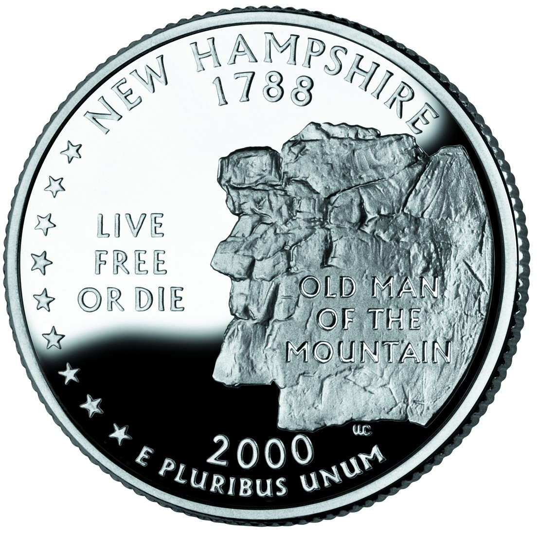 New Hampshire - I like and dislike the New Hampshire quarter. It should be noted that New Hampshire is one of those featureless states (remember, I mean "lacking features that work well on a coin"). New Hampshire liked "The Old Man of the Mountain" so much they put it on their license plates and their coin. Unfortunately, a rock formation that kinda looks like a face is pretty boring. The license looks nice because the image of the rock formation is in color, slightly faded and in the background. The coin, however, has the Old Man prominently displayed. But at least it's better than the generic alternatives. And layout-wise it's pretty good with text ("The Old Man of the Mountain") on the rock and the state motto ("Live Free or Die") in the white space. Grade: C
 Virginia - If you think about it, aside from its natural beauty, Virginia is pretty featureless. But I'm still surprised no one came up with an interesting design, even with the early/alternate designs. I'm also taking off points because of a simple rule: You shouldn't be celebrating ANYTHING seven years before it happens. Back around 2000 Virginia made this design and they began issuing "Quadricentennial" license plates... SEVEN year ahead of time. Besides, celebrating the Susan Constant, Godspeed, Discovery, and Jamestown, the first permanent English settlement in North America, is just slightly more interesting than reading this sentence. So subject-wise it's not very interesting. Design-wise it's okay. What detracts from the design is how the water just abruptly ends at the bottom (Rhode Island did a much better job of handling water on it's coin). Oh and it's pretty weird that the middle ship is going the wrong way. Grade: C
Next: New York, North Carolina, Rhode Island, Vermont and Kentucky.
State Quarters Design Review: 1999 (Delaware to Connecticut)
As the great design connoisseur that I am, I have been following the U.S. state quarters program ever since the first quarter (Delaware) came out back in 1999. The last state quarter (Hawaii) will be released toward the end of 2008.
So since 5 quarters are released each year and two quarters have been released so far this year, there are 37 state quarters out there. The designs for the remaining 3 quarters in this year have been released so there are 40 designs so far.
What does that mean to you and me? Well, I’m going to review them and I’ll grade them like I were a high school teacher. We’ll go by year and we’ll start with 1999:
 Delaware – A tough place to design for because, well, frankly Delaware isn’t all that scenic or “monumental.” Oh sure, they have nice beaches but otherwise it’s pretty flat and forgettable. So they decided to go with some dude, named Caesar Rodney, on a horse and two sets of text: Caesar’s name and “The First State.” I don’t have a problem with the “The First State” (especially since it fills up some white space) but putting the guy's name on the coin is… well stupid. Oh, and Caesar not being recognizable isn’t a good excuse because Franklin Roosevelt isn’t either and his name isn’t on the dime. Aside from that the design is carried out pretty well. Plus, it was definitely better than the other designs (“quill pen and parchment and the allegorical 'Lady Liberty'”). All in all, not a bad start. Grade: B
 Pennsylvania - A bad, bland design that spawned a trend I don’t like: putting the outline of the state on the quarter. (I especially don’t like it considering how “boxy” Pennsylvania is.) State outlines are boring and on this quarter it messes with the text. But the outline here seems to be a necessity, from a design sense, as the statue (which is the statue on top of their state capitol) alone leaves too much white space. The keystone logo is pretty boring as well and just doesn’t help the aesthetics. However, the statue wasn’t entirely a bad choice since PA’s more recognizable features (Liberty Bell, Independence Hall) have already appeared on coins. And since it’s not good politics to concentrate on one of the two major cities (Pittsburgh or Philly), they had to go with a “not very good for a coin” statue. Grade: F (Although I might consider uping the grade to a D if the student came and explained to me the merits of the statue and the difficulty in finding a good symbol not from Philly or the ‘Burgh.)
 New Jersey - Another tough place to design for because of the same reasons as Delaware. New Jersey might be a much more varied place than Delaware, but it also doesn’t have a unique memorable object. In fact, the memorable “object” they ended up using wasn’t even entirely in New Jersey, since George Washington crossed from Pennsylvania into New Jersey. Regardless, the design is simple and interesting. My only gripe being that the boat is overloaded and it’s hard to make out the details (but you have to expect that since it’s a copy of the famous painting.) Grade: B-
 Georgia - The dull state outline makes an appearance on an otherwise good design. Georgia does a good job in going with the very recognizable peach (which they also use on license plates). I also like how they made the text interesting by putting it on a banner. They also do a good job of using plants along the edge (like the old wheat pennies). The only change I would make, would be to get rid of the outline, make the oak sprigs smaller and the peach bigger (almost “sitting” on top of the sprigs). Grade: B
 Connecticut - The first quarter that made me think, “Now that’s a good design.” Connecticut was another “featureless state” (I’ll start calling states like Connecticut, Delaware and New Jersey this to make it easier) but they could have gone with sailing (which Rhode Island did a good job with, but that’s for another day). But they came out of nowhere and hit a home run, with the Charter Oak. The design is simple and interesting with the stone wall on the right counterbalancing the text on the left. So we’ll just have to forgive them for feeling the need to explain the tree with the text (although I do like the font) and the fact that the tree no longer exists. Grade: A
Tomorrow: Massachusetts, Maryland, South Carolina, New Hampshire and Virginia.
Friday, June 09, 2006
World Cup 2006
... is finally here. It'll begin today at noon (EST) with host Germany vs. Costa Rica. And I'll be somewhat useless until it ends on July 9. La Roja (Chile's national team) was officially eliminated in their final qualifying game last year. Although they were a longshot to get in, needing to beat Ecuador (they tied at 0) and a loss or tie by Colombia (they beat Paraguay, who had already qualified, 1-0) and a loss or a tie by Uruguay (who beat Argentina, who had already qualified, 1-0).
The sad thing is that of the three only Uruguay moved on, but not directly into the World Cup. They qualified for a home-and-away playoff against Australia to see who would make it to Germany. Uruguay squandered the opportunity by playing to two draws and then losing in a penalty shootout.
So thats what happened in bottom half of CONMEBOL qualifying... now on to what I think will happen.
I'll start by going to the end: I think Brazil will beat Germany for it's 6th World Cup title.
I know, everyone is predicting Brazil... sure, it's a safe bet. But I think im being bold by predicting them beating Germany because if Germany gets to the final, I think it will be TOUGH to beat them with the home crowd support. (Remember, Brazil couldn't beat France in the final when it was held in France... and the French fans are not as rabid as the Germans.)
Anyways, here are my predicted group results:
Group A: 1. Germany 2. Ecuador
Group B: 1. England 2. Sweden
Group C: 1. Netherlands 2. Argentina
Group D: 1. Mexico 2. Portugal
Group E: 1. Italy 2. United States
Group F: 1. Brazil 2. Croatia
Group G: 1. France 2. South Korea
Group H: 1. Spain 2. Tunisia
(BTW, those last two groups should be cakewalks for France and Spain... I pretty much threw darts at the wall to pick South Korea and Tunisia)
So that makes for these Round of 16 games (btw, why don't they ever call these Eighthfinals?):
Germany beats Sweden
Portugal beats Netherlands
Italy beats Croatia
France beats Tunisia
England beats Ecuador
Argentina beats Mexico
Brazil beats United States
Spain beats South Korea
Quarterfinals:
Germany beats Portugal
Italy beats France
Argentina beats England
Brazil beats Spain
Semifinals:
Germany beats Italy
Brazil beats Argentina
And I already told you the rest.
Tuesday, June 06, 2006
Redskins Lower Level Obstructed View Tickets
As I mentioned before, here are the views from the obstructed view tickets:

The view from my seat in section 220

The view from the end zone seats in section 213
(these might still be available)


(these might still be available)
Checking one off the list: Redskins Season Tickets
I have a list, as should everyone, of things I want to accomplish in my life. It spans from things I want to own (an island, a ferrari, etc) to things I want to see (Taj Mahal, Petra, etc.), from the quite useless (hit a hole in one in golf) to the more valuable (donate a million dollars). Some of the things, for "strategic" reasons (or just be mysterious), I won't reveal. Finally, some of the things have been checked off, like...
Today, I can officially call myself a Washington Redskins Season Ticket Holder. Sure it's for obstructed view seats, but there's a saying about a beggars and a choosers, something about a chooser not being able to beg or something... I don't remember. There is a post blocking about a 10 yard section of the field, but the seats are on the 40 yard line and everything else is entirely within sight.
I could have gotten a seat that was, practically, unblocked (the corner of an endzone was obstructed by a railing) but it was a single seat AND it was more than twice the price.
In case you're looking for tickets, they still have a few left... in fact, i would recommend the seats I didnt take in one endzone. They had about a third of the endzone (maybe half of the endzone for the other seat) obstructed but there was a big walkway in front of you, so there was endless legroom and you could probably stand up into the walkway to see the other side of the endzone if you had to.
Anyways, I'll be posting pictures of those seats (and mine) pretty soon.
Subscribe to:
Comments (Atom)