 Massachusetts - I am not entirely resolved as to how I feel about the Massachussett quarter. In a pure layout design sense it's near perfect: the offset Minuteman statue and the text ("The Bay State") fit around the state perfectly and take up their respective spaces perfectly. Feature-wise it's pretty boring, though. The filled-in outline of the state is definitely better than the thin outline, but it's still pretty plain. That leaves the statue as the only attracting feature which makes it barely better than the Pennsylvania quarter. (Remember that full length statues don't make good coin subjects) In fact, I would have gone with the Boston Light design but I would have filled in the spaces around the lighthouse with text, ala Delaware and Cesar Romney. Not great but definitely better. Grade: C
 Maryland - I should admit that I'm probably biased here since I associates myself with Maryland. But I like the Maryland quarter. I think the Maryland quarter is good. I just can't get it out of my head that it could have been better. They did well by placing plants (The White Oak in this case) on the edges (like Georgia), but I'm just not sure about the Maryland State House dome. It's very "statue-like" in that it takes a lot of vertical space. But at least that white space is filled by the text ("The Old Line State"). Personally, I would have like to see a rendering of the Chesapeake Bay on the quarter, but I'll deal with what we got. Grade: B
 South Carolina - South Carolina started another bad and ugly trend: randomly stuffing things onto the design. South Carolina decided to throw the Carolina Wren, Yellow Jessamine and the Palmetto tree onto they're quarter. You might argue that Pennsylvania started this (with the text, statue and keystone outline) but South Carolina took it to another level. Sure, those things aren't entirely random because they are all related to the South Carolina (being the state bird, state flower and state tree), but design-wise it's too cluttered and just makes no sense. At least they combined two elements by having the wren perched on the jessamine, but they're both bigger than the tree! (Oh, we'll see alot of that pretty soon, btw.) Just a bad design/layout all around and one that sadly was emulated repeatedly by other states. Oh and did I mention it has the state's outline on it?! Grade: D
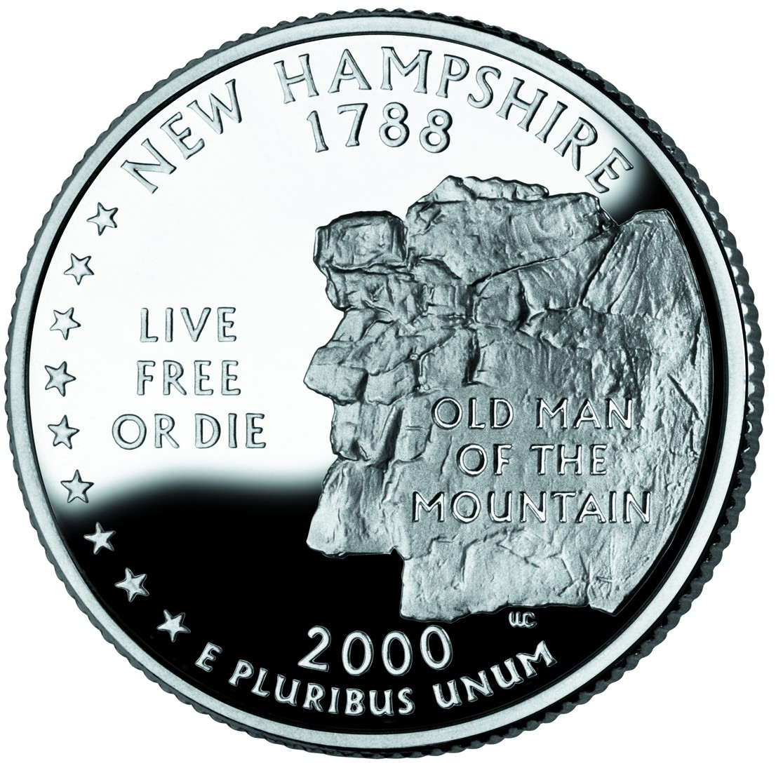 New Hampshire - I like and dislike the New Hampshire quarter. It should be noted that New Hampshire is one of those featureless states (remember, I mean "lacking features that work well on a coin"). New Hampshire liked "The Old Man of the Mountain" so much they put it on their license plates and their coin. Unfortunately, a rock formation that kinda looks like a face is pretty boring. The license looks nice because the image of the rock formation is in color, slightly faded and in the background. The coin, however, has the Old Man prominently displayed. But at least it's better than the generic alternatives. And layout-wise it's pretty good with text ("The Old Man of the Mountain") on the rock and the state motto ("Live Free or Die") in the white space. Grade: C
 Virginia - If you think about it, aside from its natural beauty, Virginia is pretty featureless. But I'm still surprised no one came up with an interesting design, even with the early/alternate designs. I'm also taking off points because of a simple rule: You shouldn't be celebrating ANYTHING seven years before it happens. Back around 2000 Virginia made this design and they began issuing "Quadricentennial" license plates... SEVEN year ahead of time. Besides, celebrating the Susan Constant, Godspeed, Discovery, and Jamestown, the first permanent English settlement in North America, is just slightly more interesting than reading this sentence. So subject-wise it's not very interesting. Design-wise it's okay. What detracts from the design is how the water just abruptly ends at the bottom (Rhode Island did a much better job of handling water on it's coin). Oh and it's pretty weird that the middle ship is going the wrong way. Grade: C
Next: New York, North Carolina, Rhode Island, Vermont and Kentucky.
No comments:
Post a Comment