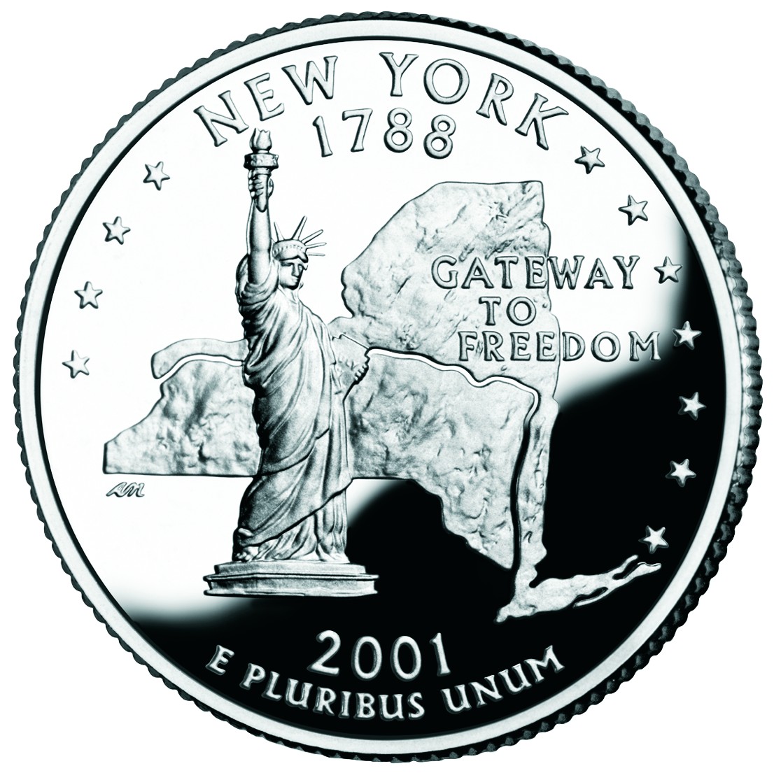
 New York - New York played it safe and went with a full body view of Statue of Liberty. I'm not saying it's a bad choice but its clichéd. I might have gone with Niagara Falls, the Empire state building (considering they're the Empire State) or something else. But I guess it was better to go the "safe route" then the entirely obscure route (Victory at Saratoga? Did they mean the Travers Stakes at the race track?) Also, they fortunately, or unfortunately depending on how you see it, didn't go with the World Trade Center Towers, which were knocked down about 9 months after the coin was released. So with another statue on a quarter, this coin ends up looking like a blatant rip-off of the Massachusetts coin (granted, with a much better known statue). The layout, however, is worse as the text is slightly muddled by the state map (at least they didn't use an outline). I like that the Hudson River and Erie Canal are shown and I also like the phrase "Gateway to Freedom" which is a nice change from an overused state nickname. Grade: C
 North Carolina - I like that North Carolina didn't play around. They were either going with "First in Flight" or the Hatteras Lighthouse. They went with the same design as their license plate, and I think they did well. However, they made the same mistake as Virginia. Instead of designing for a coin it looks like they made a design and then "cut" it into the coin, as both have a harsh line drawn at the bottom of the design. A few other states (West Virginia, Iowa) did the same thing and I think it just doesn't look good. (Actually, the next few coins give a good example of how to "end" a design on a coin.) But besides that one problem, I like the North Carolina quarter. I'ld even grade it higher if it were a bit more original. Grade: B
 Rhode Island - Last week I talked about how Connecticut could have gone with a sailing coin had they not done the Charter Oak quarter. If they had, they would have beaten Rhode Island to the "sailing" quarter simply by virtue of ratified the Constitution two years earlier (btw, Rhode Island was the last of the original 13 states to join the Union). Maryland could have also laid claim to the "sailing" quarter (ratifying a month after Connecticut) but in the end things worked out just fine... especially considering Rhode Island's nickname is "The Ocean State." So along with the sailboat, Rhode Island used the Newport Bridge and the state nickname in a very nice design. And as I mentioned earlier, Rhode Island's design perfectly avoids a straight line to define the end of the design (water). Grade: A
 Vermont - I'm not sure if there is a rule against using things along state borders, like Lake Champlain between New York and Vermont. Not that Lake Champlain would have been better then a guy collecting maple syrup sap though. Oh and tucked away behind the dude and the trees is Camel's Hump Mountain, which I wouldn't have known had I not looked it up. In all, a very good coin but basically a regular coin. But at least they did two obvious things which saved it from being a bad quarter: First they didn't end the design by "cutting it" along the bottom. Second, they were creative enough to use the phrase "Freedom and Unity." Not that I'm against state nicknames, but in this case their nickname is pretty obvious (especially if you speak french): "The Green Mountain State." So we'll give Vermont a middle of the road grade. Grade: C
 Kentucky - I should say that I like Vermont and Kentucky's quarters, it's just that they are average coins. They both went with things they are really known for (which coins like MA and VA missed on) so I feel bad giving them middle of the road... but I promise to rank them higher than those coins in the final ranking. Their problem is that they picked rather calm scenes that would have looked much better on a photo or travel poster. Kentucky went with a thoroughbred and another entity which requires looking up: The Federal Hill Mansion which looks like any other home/mansion. But, like Vermont, Kentucky should get points for not ending the design by "cutting it" at the bottom and for using "My Old Kentucky Home." (Although, that makes for a weird happening in that "Kentucky" appears twice on the quarter.) Finally, the alternate/proposed designs weren't any better in Kentucky's case, but I would have gone with a depiction of either Mammoth Cave or the stretch run of the Kentucky Derby. Grade: C
Next Time: Tennessee, Ohio, Louisiana, Indiana, and Mississippi
No comments:
Post a Comment