Saturday, December 16, 2006
Off to Chile
I haven't posted anything in awhile because I am off to the motherland this weekend and things have been hectic. (And if you didn't know I wasn't from the US of A... well now you know.) I'll be gone until next year (January 6th to be exact), so I probably won't be writing all that often,but you might as well check to see if I update this thing. You can of course email me to your hearts content, and I'll be happy to quickly delete them. Joking of course... I'll give it a glance before I delete.
Monday, December 04, 2006
Ovechkin fined for hit on Briere
I stated Sunday morning that I thought Alexander Ovechkin's hit on the Sabre's Daniel Briere, although warranting a penalty (because it was boarding), did not deserve additional action by the league. Well the league decided it deserved a $1000 fine. That kinda confuses me.
First thing, $1000 really is nothing. It seems like it's only meant to appease the Sabres while at the same time not be rediculously unreasonable. But it really makes no sense. The way I see it, the league should either say it was a "dirty" hit (i.e. a hit that intended to injure) and fine AND suspend him or you say it was an illegal but "clean" hit (i.e. warranting a penalty but not intended to hurt).
Ovechkin even says the league recognized that it wasn't a dirty hit... so what's the deal? If it's not dirty why fine him? The league certainly doesn't fine EVERY player who gets called for boarding, charging, or crosschecking (all penalties which could be considered "dirty" by the team taking the penalty). So what was so special about this hit?
If you watch the video you'll see that Ovechkin picks up a lot of speed and chases Briere out of the Caps defensive zone. Right after Briere dumps the puck, Ovechkin turn to check Briere (an entirely legal check since Briere just had possession of the puck). Right after Ovechkin turns Briere heads to the bench (turning his back to Ovechkin), and Ovechkin hits him with his shoulder in the back. Just a normal shoulder check, no charging, no follow through... simply nothing which someone could reasonably consider dirty.
Granted, I'ld be pissed if this had happened to a Cap, but I'ld have to be reasonable about it, all things considered. It was an unfortunate sequence, but I just don't see what the league expects Ovechkin to do if presented with the same situation. So the league fines Ovechkin a meager $1,000, and the Sabres are still going to retaliate in their next game. I just hope the fine for retaliation is much more than $1k...
No Pull Harness Review: Part 2 - Reviewing the Easy Walk Harness
I've gotten a good amount of hits looking at my post on No-Pull Harnesses/Front lead harnesses from last year. So here is the update:
First thing, last year I commented on how most big chain pet stores (and most of the smaller local stores, as well) didn't carry front lead harnesses. Well, the first update is that practically every PetSmart and Petco I have been too seems to now carry the Easy Walk harness by Premier (the same one I got for Gilligan (my dog... technically a "beagle mix", but he looks just like a slightly taller than average beagle). This, of course, is understandable since Premier is a big name in leashes, harnesses, etc and is already carried by both mega-retailers. However, none of the chain stores seem to carry Wayne Hightower's harness or any of the Softouch Concepts harnesses. A shame I guess since I'm not going to shell out the cash to try those harnesses, so I can really only comment on the Easy Walk Harness.
On that note, here is my quick review of the Easy Walk Harness:
The harness took some getting used to for Gilligan. He still tries to chew at it when it first goes on, but once we get outside it's normally not a big deal.
Pros: It works. It doesn't choke him (like a choke collar) or his legs (like a sporn harness). The materials (webbing, clasps, etc.) are good quality and well constructed. A different color webbing is used for the strap which goes under the dogs chest, making it easier to put on correctly.
Cons: Although the differnt color webbing helps, it is still a little complicated to put on, especially when your dog isn't looking to put on the harness. Additionally, it takes more time and effort to put on then to just click the leash to the collar. The harness seems to loosen easily if slightly (that is, not enough to come off but enough to require more adjusting than you may want to deal with); I think this problem happens because of the smooth metal buckles it uses and I think it comes up more often when you set it "small."
The first con (the harness is not easy to put on) is one that I think, unfortunately, is a result of design that will be found in all front lead harnesses, and maybe even harnesses in general. The second con (the harness loosens) may be a result of the choice of buckles, which may not be an issue on the other harnesses. In general, I am happy with the harness, but to be honest I don't use it that often. Mostly because of the time required to put the harness on and but when I do use it... I enjoy it.
Sunday, December 03, 2006
College Hoops and The Caps beat the best
A few interesting happenings from last night in the world of sports:
- First, check out this D-III college basketball score. Thats right... Lincoln University beat Ohio State Marion, 201-78. Thats more than 5 points a minute scored by Lincoln. I also thought it was weird that apparently there is a school named Borat. ("The previous largest margin of victory in a Division III game was 112 points, set by Eureka College in a 149-37 victory over Borat on Nov. 29, 1989.")
- The Caps beat the "Eastern Conference leading" (Comcast SportsNet drove that point into the ground) Buffalo Sabres, 7-4. The Caps started well by scoring 3 goals in the first eight minutes. Buffalo's first goal came with about 5 minutes left in the first period. In a fluke play, Olie Kolzig went to fall on the puck with his catching glove and, instead of covering it, he squeezed it (like a watermelon seed) into the net.
Alex Ovechkin was ejected in the second period for a hit on Daniel Briere, which sent Briere head first into the boards. However, unlike Sabres coach Lindy Ruff, I don't think the hit deserves "disciplinary action." Briere had just passed the puck and Alex hit him square on his back, with Briere about 5 feet away from the boards. It was a perfect distance for Briere to fall and take the brunt of the fall with his head on the boards. It was a scary hit but I fail to see how this should result in any action by the league.
In fact, I was even surprised to see Oveckin ejected. Most boarding penalties come as a result of a hit in which the player hits his head on the boards. Most of the time they are so close to the boards they can brace themselves enough to take some of the fall with their arms (since they put their arms up on the boards). Briere, however, was at such a distance that he really could not prevent his head from hitting first and doubt Ovechkin planned anything more than just a check to the back. But I guess we'll see if the league sees it otherwise.
Friday, December 01, 2006
Ranking the DC Sports Newscasts
Back when there was a movie theatre on the corner of Wisconsin Ave. and Van Ness St. (where AU's Greenberg Theatre is now), I went to see a sneak preview of Jetsons: The Movie. I found the best spot in theatre: two seats hidden by themselves on the right side aisle which were practically in the middle. The theatre had a weird slanted wall that cut what would be the right rear half of the theatre off.
So I was sitting there and this guy comes walking right up to the seats and when he gets there (it was already dark by then) he seemed a little shocked to see me. He says something to the effect of "Ahh! Those are my favorite seats." And then walked away a little sad I guess but not at all mad (at least he didn't seem mad). Anyways, that was my one time run-in with Arch Campbell. Seemed like an alright fella, but he still creeps me out when his teaser (always ending with an overenthusiastic "NEXT!") and his wide-eyed reviews which I frequently disagree with.
This week I found out he's joining George Michael in leaving NBC 4. I was even surprised to find out that Susan Kidd and I.J. Hudson were leaving. Sad really. Not that I particularly liked them, but I grew up on them.
Well in light of this I've decided to rank the DC sports newscasts with my two cents on each:
4. WRC Channel 4 / NBC - With George Michael leaving this group is left floundering with Lindsay Czarniak and Dan Hellie. If you read my ramblings you know how I feel about Czarniak. Put it this way, there's a reason why I have "Czarniak's quote of the Day/Week/Etc" and its not because she's witty. Hellie is not bad, but he's a little too proper and doesn't seem to do much more than just read copy. In fact, I think he would do much better as an anchorman.
3. WJLA Channel 7 / ABC - I don't know what else to say but this: Vanilla. Not bad, but certainly not outstanding. Tim Brandt is fairly unanimated, but at least he knows his stuff. Greg Toland is serviceable but you're not winning a Super Bowl with him. He's a more animated but less "pretty boy" version of Hellie. And sometimes channel 7 throws a screwball by pulling crazyman Glenn Harris out of his crypt. (Mostly though, I see him on his Newschannel 8 show... is that even still on?!) These guys really took a tumble after Rene Knott left.
2. WTTG Channel 5 / Fox - I've always thought Dave Feldman is a better sportscaster than he is a soccer play-by-play man. (Maybe it's because I'm not a fan of his "It's in the net!" goal call.) Not that his play-by-play is bad, but he's got a very good personality for sportscasting. Lou Holder is good. He's a slightly more enjoyable newscaster than Toland. Finally, I'm not 100% sure how I feel about Dave Ross so we'll give him a solid C.
1. WUSA Channel 9 / CBS - Brett Haber used to be on ESPN's SportsCenter and he still announces like it. Most of those guys have "it" (what it takes to be a good sportscaster), but unlike a lot of those guys he doesn't come off sounding like such a tool. Levan Reid is stiff but has a good delivery and comes off seeming genuine. Sarah Walsh is also a very good sportscaster and, I think, earned her spot for her abilities instead of her looks (I'm looking at you Channel 4!).
Wednesday, November 29, 2006
Skins, Caps, Wizards and Terps Predictions
Almost 3 weeks ago I was ready to talk up the Caps. I was entirely ready to use the overused and obviously premature "if the playoffs ended today" line by pointing out that the Caps would be in. So that day I went to write and lo and behold, I was surprised to find that good ole' Teddy L. beat me to the punch (oddly enough it was in his 500th post). So I didn't post, but the braggadocio karma still hit. The bottom of my "slurpie cup of happiness" busted... 6 losses in a row, including two loses to the lowly Bruins.
So not only were the Redskins catatonic and the Wizards not up to last years par, the Caps offense just couldn't make up for the defense. (The Caps were outscored 9-25 during those 6 games) Even the Terps football tanked losing to Boston College, getting a reprieve when Miami beat BC, and losing to Wake Forest at home this past week. My only solace comes in the surprisingly good Terps basketball team (currently undefeated and the only 8 win team in the nation).
But then the Redskins win (although they looked kinda like a newborn horse trying to stand up in the process), the Caps beat a southeast conference foe who have had their number recently (Tampa Bay, although that could be said about the Trashers and Canes as well), and the Wiz... well, they squeaked by the Hawks... we'll just leave it at that.
So what does all this mean? Here is my "if the season ended today"-ish predicitons:
Redskins: I've already spoken here... they're dead... i.e. good for another 2 wins. Maybe we can hope for a good draft pick.
Caps: Very intriguing. Alexander Semin returns and the teams looks like an offensive powerhouse against a very good team. I'll say 7th place in the East, giving their first round opponents a scare, but losing in 6.
Wizards: Basketball, especially the NBA, is one of those games which I can't watch sometimes because I seriously get too mad. The referees have TOO much control of the game and in the NBA it's compounded by how much they protect their star players. Unfortunately Gilbert Arenas isn't star enough... oh yeah and they don't play any defense. They might get by a first round series, but will lose whenever they play the Cavs or Heat.
Terps Football: They're supposedly going to play Navy (in the Meineke Car Care Bowl) or Purdue (in the Champs Sports Bowl). I feel good about the Terps chances against either opponent... but I would think the Mieneke Car Care Bowl would prefer to have the Terps there to get themselves a bona fide "Crab Bowl."
Terps Basketball: Shhhhh, I don't want to talk about it.... karma is listening.
Sunday, November 26, 2006
Redskins Pyrite
I had resigned myself to not writing about the woeful Redskins, who had truly become among the worst teams in the NFL. But I just can't help myself because driving home from FedEx today, I was listening to the Redskins post game show and heard ridiculous optimism from Redskins fans who dared use the term "win out." The Redskins at 9-7? How insane is that? Did they even watch today's game? Or did they only watch Chris Cooley's touchdown and Sean Taylor's interception?
The Redskins are still a bad team, it's just that today the defense tackled and play more like last years defense. But after changing QBs, Al Saunder's complicated offense is still not clicking. Mark Brunell would have been the winning QB had he still been the starter because Campbell did nothing extremely out of the ordinary.
Don't get me wrong, I think Jason Campbell has got huge potential, but take away that 66 yard touchdown to Cooley and Campbell has a grand total of 52 yards passing. And he threw 2 interceptions, one of which was negated by a roughing the passer penalty. Don't be fooled, the defense won this game, but only because they played slightly better. Remember, last week (like this week) the Redskins scored 17 points, it's just that this week the defense didn't give up the second touchdown, keeping the Panthers to 13 points (instead of the 20 they gave up to the Bucs).
There are 5 more games left in the season and I would put a 2.5 on the over/under. I seriously doubt they win a game on the road (New Orleans and St. Louis), they seem positively listless away from home. They probably lose one more at home (maybe the Giants game), and that would put them at 6-10 (7-9 if they're lucky and pull an away win or win out at home). Yup, right about where I think this team deserves to be.
Thursday, November 09, 2006
Gillers in Shenandoah NP and Zoomr
A few weeks ago we went for a short afternoon hike with Gilligan in Shenandoah NP. He loved it and smelled everything on the way in and out. This is him at an overlook along the AT. A few seconds after this picture he got a tick on his leg... Cindy pulled that little bastard off quick!

oh and this picture is hosted by Zooomr.com (btw, remember the extra "o" in Zooomr), a sweet (and free) photo hosting service... like flickr, but better. And in case you wondering, yes the reason i posted this is so i could upgrade to a pro account.
oh and this picture is hosted by Zooomr.com (btw, remember the extra "o" in Zooomr), a sweet (and free) photo hosting service... like flickr, but better. And in case you wondering, yes the reason i posted this is so i could upgrade to a pro account.
Monday, November 06, 2006
Go bake a cake.
This probably only applies to you if:
1. You live in the DC area (or near a Safeway, Vons, etc.)
AND
2. You want to bake a cake at some point.
So here's the deal. Safeway currently has a Buy One Get One (BOGO) free deal for Betty Crocker's Super Moist Cake Mix. (They sell for about $2) But they are also having a deal that if you buy 10 Betty Crocker items you get $10 off. SOOOO if you take 10 cake mixes up to the register, they should come out to between -$0.70 and $2.00 total for 10 cake mixes.
The Math: 5 boxes (plus 5 free boxes) x $2 = $10 - $10 (for getting 10 Betty Crocker items) = some where around $0, depending on how much one box sells for. Kinda complicated, I know, but it's worth a try... to see how it has worked for others check out the SlickDeals thread on the deal.
Thursday, October 26, 2006
Which photo do you LikeBetter.com
So a little while back I wrote about the 20 questions site. Cool site but it would be wrong every so often. Well, now check out LikeBetter.com.
Sort of the same concept, except it guesses things about you after you tell it which picture (of two) you like better. Interesting concept....
Sort of the same concept, except it guesses things about you after you tell it which picture (of two) you like better. Interesting concept....
Did you need a new pair of shoes? Footlocker Sale this weekend.
This weekend (Oct 26 to Oct 28) Footlocker (which also owns Champs, and Footaction) is having their Friends & Family sale, which means you get 30% off (and an additional 10% if it's over $100) by using these codes:
FF6TV345 at FootLocker
FF6TVL66 at Champs
FF6TVPL6 at Footaction.
Online, though, they seem to share the same inventory. If want to walk into the stores check out this SlickDeals' post for printable coupons.
FF6TV345 at FootLocker
FF6TVL66 at Champs
FF6TVPL6 at Footaction.
Online, though, they seem to share the same inventory. If want to walk into the stores check out this SlickDeals' post for printable coupons.
Wednesday, October 25, 2006
NFL Rankings - Week 8
Three weeks ago I lost my internet connection right before the weekend, which made it nearly impossible for me to post my entirely useless (to you) rankings. The past few weeks I just didn't feel like. But then last week I saw this post over at ArmchairGM.com.
The user (DNL) did a BCS like ranking of the NFL (yes I don't like the BCS system either, but there is some merit to it when it comes to ranking). I liked the idea a lot, except for one problem: DNL used only the ESPN ranking to act as the human element. So I decided to do the same thing but instead I included human rankings from FoxSports (Peter Schrager), and CBS Sportsline (Pete Prisco). I wanted to add CNNSI's (Dr. Z) NFL power ranking, but that doesn't get released until midweek (tomorrow I'll add it and see how much of a difference it makes.
I also left out one "computer" from DNL's list (the one done by an ArmchairGM user) because I don't know if it will be consistently posted. I did the BCS thing, where all the human rankings are equally balanced and the computer average constitute a "5th human ranking."
And, like with the BCS, the highest and lowest ranking from the computers are dropped from the average (just to keep crazy computer stuff a in check).
I also ran a "straight-up" average where every ranking is taken equally and no ranking (i.e. high/low) is dropped. That way I could see where the computer or human bias was.
Here are the more humanized "BCS-style" rankings (with "straight-up" ranking in parenthesis):
1. Chicago Bears (1)
2. Indianapolis Colts (2)
3. New England Patriots (3)
4. Denver Broncos (5)
5. New Orleans Saints (6)
6. New York Giants (4)
7. San Diego Chargers (7)
8. Baltimore Ravens (8)
9. Atlanta Falcons (9)
10. Cincinnati Bengals (10)
11. Carolina Panthers (13)
12. Seattle Seahawks (14)
13. Minnesota Vikings (12)
14. Philadelphia Eagles (11)
15. St. Louis Rams (15)
16. Jacksonville Jaguars (16)
17. Dallas Cowboys (17)
18. Pittsburgh Steelers (18)
19. Kansas City Chiefs (19)
19. New York Jets (20)
21. Tampa Bay Buccaneers (21)
22. Washington Redskins (22)
23. Green Bay Packers (23)
24. Buffalo Bills (24)
25. San Francisco 49ers (26)
26. Cleveland Browns (25)
26. Houston Texans (27)
28. Tennessee Titans (31)
29. Detroit Lions (28)
30. Miami Dolphins (29)
31. Oakland Raiders (32)
32. Arizona Cardinals (30)
A few thoughts:
- The "straight-up" ranking pretty much follows the "BCS-style" ranking except for towards the end (where the teams are pretty much equally bad) and with a few teams, Giants, Eagles and to a lesser extent Vikings. We'll discuss that in a second.
- Although, all the humans like the Broncos (#3 in every human ranking) more than the Patriots (#4 in every human ranking), the computers prefer the Pats. In fact, the computer prefer the Pats so much more that it was enough to drop the Broncos (averaging #8 in computer rankings) behind the Pats in the "BCS-style" ranking.
- As I mentioned the "straight-up" and "BCS-style" rankings pretty much agree. Well, except when it comes to the Giants and Eagles, and to a lesser extent the Vikings. The Giants (#6 "BCS-Style") average a #3 ranking with computers and the Eagles (#14 "BCS-Style") average #11 (when removing high and low) and #9 (without removing high and low) with the computer rankings. That means the computers seem to like the Giants and Eagles (and Vikings) more than the humans. My guess is that the computers give more credit for the Giants' strength of schedule and the humans don't give enough credit for close games (which accounts for all of the Eagles' losses).
Sunday, October 22, 2006
Lindsay Czarniak Quote of the Week
"He's running so fast, he falls out of his shoe."
Describing Hines Ward's reception for a touchdown where he loses a shoe about 30 yards away from the end zone and runs the rest of the way missing a shoe. At no point during the whole play (even once he gets into the end zone) does he fall.
Thursday, October 19, 2006
Project Runway 3 Finale: Jeffrey wins
Although I haven't mentioned it, I have been following the 3rd season of Project Runway. I had tried to avoid watching since I was really turned away by the fact that the producers have a say in the results. In fact, if you remember from earlier this year, I completely hated how season 2 ended. I even had an imaginary back-and-forth with the "winner", Chloe.
Anyways, following that farce and the fact that, as a whole, I didn't particularly like this bunch of designers (personality-wise), I tried not to follow the show. But I succumbed and followed it by proxy (that is, Cindy watched it consistently, and I watched for the final pieces and who was eliminated). I grew to like the designs of Bonnie, Allison, Michael, Uli and Jeffrey. Bonnie and Allison were eliminated relatively early, but Michael, Uli and Jeffrey made it to the finals (Laura also made the finals, but I thought, although she was good, she was never really innovative).
So I was happy to see those three in the finale. I felt Michael and Uli were consistently good but never entirely outstanding. Jeffery, though, was much more daring... he really swung for the fences on every piece. Sometimes he struck out and sometimes he hit a homerun. And on his final collection he hit more homers than the competition, so I agree that he deserved to win. So I guess things have come around in the Project Runway world... now let see if Top Chef is worth it this year.
Tuesday, October 17, 2006
Back on the Hook: Heroes
The 2000s should probably come to be known as the point where television became like the movies. I think 2 television shows can take most of that credit, 24 and CSI. 24 truly borrowed from movie making, first by taking a "movie star" in the lead role and second by using the shoot-em-up/explosions you used to only find in theatres. The CSI series doesn't concentrated on that aspect, but it added movie-like special effects to the police/investigative genre (remade popular in the 90s by NYPD Blue and Law and Order). So although, CSI made it okay to have episodes like "Code Black" on Grey's Anatomy, 24 really paved the way for shows like Lost and the already canceled, Heist (although those are ensemble casts instead of a "movie star"-led series).
I never got into 24 but I was looking forward to Lost when I first heard about it, but I missed the premier and then just never followed up on it. I never thought I would get into these kind of shows. I mostly didn't like the hype around the shows but I also didn't like how a plot, which would work better as a movie, would be put into a television series because a TV series NEEDS to draw out the story line. So I was thinking I was immune to these shows... until this season: I am all about Heroes.
I'm stupidly into it even though I fully realize there is no chance this is ending well. One of three things is going to happen, and all them are bad: 1. They're going to cancel the show; 2. It'll start to suck; or 3. They're going to draw the story out over 8 season, and I'm going to spend each summers with a "cliffhanger" looking forward to another season of entirely unlikely twists and pseudo-resolutions to current plots.
Oh well... if you'd like to join me just click on that link up there (or this one one), get caught up, and watch monday nights at 8 pm on NBC! God, I'm retarded!
Sunday, October 15, 2006
Redskins hit bottom
The Redskins can official go no lower. Sure, they could lose 45-0 at home against the Raiders... but they're not playing them this year. Losing to the lowly Titans and their awful rookie quarterback at FedEx Field on Sunday will have to substitute for "rock bottom." We knew the offense wasn't clicking, and that the secondary was bad, but at least the run defense was good. Well, at least until these last two games.
I could give you figures like, the Redskins have allowed a 100-yard rushers in each of the past two weeks or that the Redskins have 5 takeaways (only the Houston Texans have less with 3), but nothing really explains it better than this: The offense is struggling like the end of last year and the defense is nowhere near as effective as last year.
Well let me restate that: The defense is alot like last year except that they aren't forcing turnovers or scaring anyone. Last year the Redskins seemed to always get a turnover when they needed it and this year they're giving up too many 3rd and longs for first downs.
So I'm glad they lost because one of three things was going to happen this week: 1. The Redskins win big and they actually get better the next few weeks. (The ideal situation, which apparently had no chance of happening.) 2. The Redskins have a close win and get a reason to become complacent (Probably the worst situation, becuase they would continue to barely beat scrubs and losing to the games that matter.) and 3. The Redskins lose.
The reason #3 is better than #2 is because this forces the Redskins to make changes they need to make. In essence, it makes them desperate. These past two games actually remind me of last season when the Redskins lost 2 straight home games (to the Raiders and Chargers) to drop to 5-6. They went on to win 5 straight to finish 10-6... We'll see if they can do something similar this year. Considering next week they're going to play the Colts in Indy, I seriously doubt it.
Saturday, October 14, 2006
Singing Rabbit Skittles Commercial
I realize I am WAY late for the party, but I just love that Skittles Commerical with the singing rabbit. It just gets stupid funnier everytime I watch it.
Friday, October 06, 2006
TACA Keeps it Real
I'm going to Chile for the Christmas/New Years holidays and the cheapest flight I could find was on TACA, an El Salvadorean airline. So I was checking their baggage policy and found an interesting tidbit under "Carry-on baggage." Go ahead and read the policy and making note of the 7th item down on the list of permitted additional carry-on. (Don't forget to come back when you are done.)
Okay, so if you are too lazy to go read it, this is what it says:
Yup! Out of nowhere TACA gets nasty with the handicap.
In all fairness, invalido is an acceptable term in Spanish... but really, no one caught this? Or am I crazy for thinking that is kinda wrong? (And who decided invalid, in this case, is pronounced with the emphasis on "LID" instead of "VA"? This also reminds me of how I hate that there can be different pronounciations for words that are spelled alike... like "Live from New York" and "Live Free or Die")
Okay, so if you are too lazy to go read it, this is what it says:
A fully collapsible invalid’s wheelchair or any other orthopedic device of passenger’s use provided that passenger is dependent upon them.
Yup! Out of nowhere TACA gets nasty with the handicap.
In all fairness, invalido is an acceptable term in Spanish... but really, no one caught this? Or am I crazy for thinking that is kinda wrong? (And who decided invalid, in this case, is pronounced with the emphasis on "LID" instead of "VA"? This also reminds me of how I hate that there can be different pronounciations for words that are spelled alike... like "Live from New York" and "Live Free or Die")
Saturday, September 30, 2006
NFL Week 4 Rankings
I like being right. So, I enjoyed how my rankings panned out. Granted, I waited until 2 weekends had gone by, but I think that is a much better way of evaluating teams as opposed to, in essence, guessing at it in the preseason.
Anyways, this week I'll try and remember to include the Carolina Panthers (who would have been ranked with the other "Bad" 0-2 teams last week). I realize that the bottom categories are overloaded (I only have 11 teams, or 34%, above "The Middle") but that will even itself out once teams establish themselves better. For now, not many teams seem worth of being called "good teams."
I'll also explain a few things: First, there should be little to no reason to drastically move teams, so teams will/can, almost without exception, only move one category each week (i.e. no team should go from "Bad" to "Step Away" in one week.); Second, for the sake of space I probably won't discuss teams coming off their bye week. And third, teams that have moved up will be bolded and teams that have dropped will be italicized. Now on to the ranking:
The Best (Indianapolis, San Diego, Cincinnati, Seattle) - Everyone stays the same here. While San Diego sat at home this weekend, the rest of these teams came out and beat formidable opponents (Maybe excepting Seattle, who beat a NY Giants team I don't entirely respect).
The Questionable Best (Chicago, Baltimore, Jacksonville) - Chicago and Baltimore stay here by barely beating teams they should have pummeled if they wanted to be among The Best. Jacksonville played Indy close, but they could drop if they lose to the Redskins (probably not happening).
Step Away (New Orleans, Atlanta, New England, Denver) - New Orleans stays here because of their questionable competition and their emotional win on Monday night. Atlanta and New England drop because of entirely different losses. (New England was uninspired and Atlanta was, practically, beaten by a nation.) Denver joins this group by being the only "Middle" team to win.
The Middle (Dallas, Pittsburgh, Philadelphia, NY Jets) - Remember how last week I put Philly and the Jets in the "Not So Good" category? Well, they still deserve to be there, since they beat the lowly 49ers and Bills this week. But they get moved up because of their records. (Philly, will most likely stay here for a while, as it continues its early creampuff schedule next week against the Packers, but the Jets should come back to earth against the Colts and then the Jaguars.) Pittsburgh drops because they're beginning to show their true mediocre colors. In fact, Bill Simmons writes about a theory (which he discounts) about how Pittsburgh is going through the "Super Bowl Loser Curse" because they were supposed to lose the Super Bowl (as the lesser team) but since the refs intervened, they ended up winning. I don't think it's all that crazy.
The Not So Good (Kansas City, St. Louis, NY Giants, Buffalo, Carolina) - Buffalo and New York begin what I predict to be a season long oscillation between the "Middle" and the "Bad" for each team. I moved up Carolina, for beating a conference rival on the road, but they looked really bad doing it. Once again... I really don't respect the NFL South.
The Bad (Washington, Miami, San Francisco, Arizona) - Washington stays here because they only slightly improved against Houston. Too many penalties, the defensive line looked bad and the pass defense looked worse. The rest of the teams stay here because they lost, but not bad enough to be dropped to "No Chance".
No Chance (Tampa Bay, Oakland, Detroit, Houston, Green Bay, Tennessee, Cleveland) - Everyone stays put and welcome their new friend, Tampa Bay. Tampa Bay drops mostly because of the Chris Simms injury. Now I have never thought Chris Simms was a good quarterback (he certainly hadn't shown me any reason to change my mind this year) but his team liked him. And that has to mess with them. m seemed to trust him.
Friday, September 29, 2006
New NBA Ball
So this came out awhile ago, and I noticed I had started the post but never uploaded it... here it is:
I'm looking forward to seeing the NBA play with their new ball. Not that I'm expecting anything different, I just think it looks snazzy. Oh and if you want one, you can order it from the NBA Store... It's a mere $100.
I'm looking forward to seeing the NBA play with their new ball. Not that I'm expecting anything different, I just think it looks snazzy. Oh and if you want one, you can order it from the NBA Store... It's a mere $100.
Sunday, September 24, 2006
My first NFL ranking of 2006
Needless to say, I haven't been very happy with how the NFL season has panned out so far. The Redskins are bad. The offense looks like it did at the end of last year but this year the defense is matching them in ineptness. (In particular they're not getting any production from the defensive line allowing the opposing QB all day to throw.)
Anyways, I've taken it upon myself to rank the teams again this year. But this time I'm doing it a little different. This year I am making 7 categories and putting teams into those categories.
So anyways, here are the categories/rankings:
Anyways, I've taken it upon myself to rank the teams again this year. But this time I'm doing it a little different. This year I am making 7 categories and putting teams into those categories.
So anyways, here are the categories/rankings:
The Best: Indianapolis, San Diego, Cincinnati, Seattle
These are the undoubted best teams in the league. The only team I really question is Seattle, but since they were in the Super Bowl last year and are currently 2-0, I have to put them here.
The Questionable Best: Chicago, Baltimore, Jacksonville, Atlanta, New England
These teams are very good but I question their records because of who they have played (Chicago and Baltimore) or how they have played (Jacksonville, New England). When it comes to Atlanta, I just don't trust their system.
Step Away - Minnesota, New Orleans, Pittsburgh
These teams are a step away in that they're good teams but they have some glaring issues. They are a step away from showing their true colors or from stepping up to "very good" status. Minnesota was given a win by their two opponents with a missed field goal (Washington) and stupid attempted lateral (Carolina). In essence, New Orleans has barely beaten the two worst teams in the league. To be quite honest, those two teams are here because they each have a pair of fortunate wins. Pittsburgh was fortunate to beat Miami in the opening weekend and they were blanked by the Jaguars on Monday night. However, of the three, they're the most respectable.
The Middle - Dallas, New York, Denver, Buffalo
The name says it all. I have to respect each of these teams but I don't trust any of them... In particular I don't trust any of these team's wins. Dallas beat an anemic Washington team. New York got lucky when Philly decided not to play the 4th quarter. Denver lost to a not very good St. Louis team and barely beat Kansas City in OT. Buffalo is it's own beast in this group in that they beat a questionable team (Miami) but they played well in their loss against New England.
The Not So Good - Philadelphia, NY Jets, Kansas City, St. Louis
These teams are on the brink. Like the "Step Away" and "The Middle" teams they could easily go either way. Philly and the Jets are down here because their lone wins were absolutely unimpressive (against Houston and Tennessee). Kansas City is here because of their 0-2 record, they just haven't played bad enough be ranked farther down. St. Louis is the real question mark of this bunch: they beat Denver and then lose to the 49ers.
The Bad - Washington, Miami, Tampa Bay, San Francisco, Arizona
These teams are bad. Washington, Miami and Tampa Bay are all 0-2 but at least they have a lot of potential... they just need to show up. Arizona has some potential but in the end they have a history of losing to overcome... just like San Fran (at least recently).
No Chance - Oakland, Detroit, Houston, Green Bay, Tennessee, Cleveland
The name really says it all. These teams are just bad and there is no reason think any of them is doing anything this year. Oakland, Detroit and Houston had some reason to dream, but they definitely haven't done anything so far this season to keep dreaming. Green Bay and Tennessee are equally bad, but there isn't any reason be hopeful there. I'll guess that Cleveland is probasbly the closest to doing something interesting.
Thursday, September 14, 2006
Juan's Rule O' Thumb: Wash your rice... not you pasta
So, I was reading WashingtonPost.com and came across Kim O'Donnel's Food Blog and I got stupid giddy when I found out that there's a new Trader Joe's opened right down M Street from me. Now I don't have to go all the way out to Virginia or Maryland to go to Trader Joes.
But the big reason for this post is this: apparantly, this Kim O'Donnel character didn't wash his/her rice. What kinda food blogger doesn't wash their rice?! Next thing I know she'll say that she washes her pasta after draining it. (BTW, if you wash your pasta after draining it, we need to talk.)
But the big reason for this post is this: apparantly, this Kim O'Donnel character didn't wash his/her rice. What kinda food blogger doesn't wash their rice?! Next thing I know she'll say that she washes her pasta after draining it. (BTW, if you wash your pasta after draining it, we need to talk.)
Monday, September 11, 2006
WRC4 Sports coverage makes me cry
Channel 4's (WRC-TV) sports coverage is KILLING ME!
First thing, I've never been a fan of how they add crowd noise to highlights. The worst is when they add cheering to a highlight, when the away team scores or does something cheer worthy... umm, exactly why would the home crowd cheer their team being scored on?
Then they replaced Wally Bruckner with Dan Hellie. Now, I'm not saying I don't like Hellie, but it wasn't exactly an upgrade. According to the Reliable Source Bruckner was getting to expensive... but I just don't buy it. Especially with the recent addition of the worst sports reporter I've seen in a while: Lindsay Czarniak.
Where should I start on the things that bother me about her? Maybe it's the "deer in the headlight" eyes. Maybe it's the creepy, fake looking and never changing smile. I think mostly it's her copy and commentary, though. She drops cliches and says things at the entirely wrong time. For instance, on tonight's Sports Machine she said "Watch this catch!" on a pass to a receiver who was jogging (not running), because he was all by himself, and caught the ball in stride. An undeniably unspectacular catch.
Another one of her gems from tonight while describing a win streak: "back-to-back, three wins in a row." um, last time I checked back-to-back was only 2 wins in a row, but whatever right?!
Anyways, I've decided to do a Lindsay Czarniak quote of the day/week/month everytime I hear one of those bits of wisdom from her.
Thursday, August 24, 2006
Tuesday, August 15, 2006
State Quarters 2004: Michigan to Wisconsin
This time no long useless rant... just Quarters!
 Michigan - You've got to hand it to Michigan: They just put their state, the great lakes and "Great Lakes State" on their quarter... and that's it. It's as if the entire state just said, "Eh... Let's not put anything memorable on our quarter." Okay, so that's a little overstating it, especially since the design "Voted #1" (according to QuarterDesign.com) had a bunch of little Michigan "trinkets" on it. But, the Mint must have decided that the trinkets (which included the Model T and the Mackinac Bridge) were too small, not coinable or just looked bad. I would agree with that and considering the other four trinkets were not Michigan specific (a star, a lighthouse, a tree and a canoe), I definitely like that those things were left off. But then the quarter was left looking like an almost featureless map. They probably deserve a C for not ENTIRELY baking the dog on this one, but I'm not feeling charitable... Grade: D
 Florida - Florida is a beautiful place... but it sure is all kinds of messed up. The state is an amalgam of entirely different cultures living in a hot place, kinda like a nicer version of Iraq. You've got the Bible Belt folks in the north and panhandle, who are really south Georgians and Alabamans, along with the younger, hipper types in the more densely populated south and along the coasts. (Not to mention all the retirees scatter throughout.)
The state is a mess, so it should come as no surprise that their quarter is a mess as well. They've got a spanish galleon, the space shuttle and a beach with palm trees. Doesn't make a lot of sense until they add the "Gateway to Discovery" motto. But then that doesn't make much sense either because, if Florida is the gateway to North America (something it IS part of) how can it also be the gateway to space (something it's not part of). Plus the design is horrible, with out of proportion subjects and too much white space. Good try Florida, but NO that's not gonna fly! You should have just gone with the Everglades or St. Augustine quarter... Grade: D
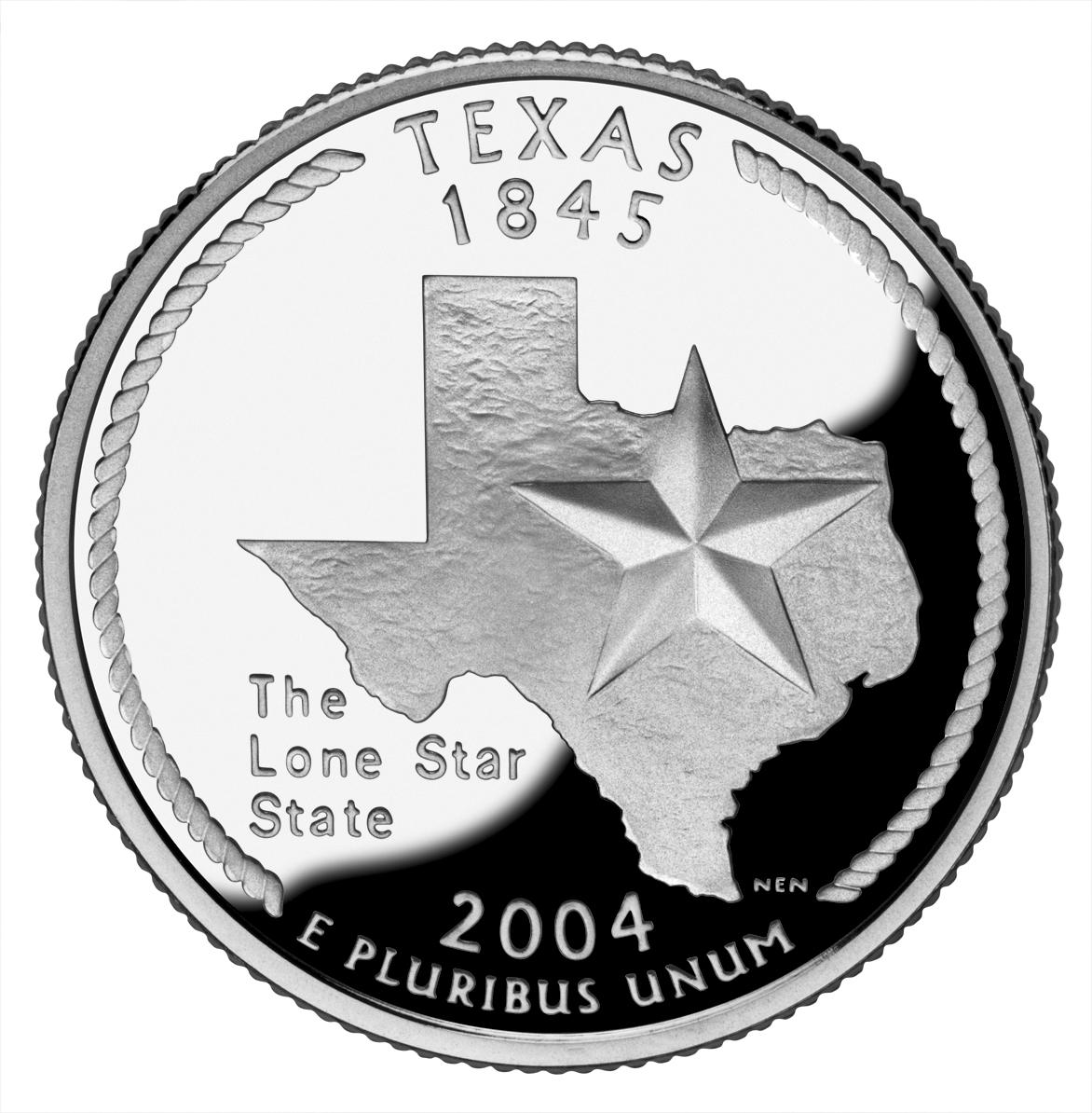
 Texas - I've got to admit, I've never been much of a fan of Texas. I just don't like the whole "Don't mess with Texas" ideal (and, yes, I know it's an anti-littering campaign, but its also a "better than you" attitude). And that's strange because, I've liked practically everyone I've met from Texas and I've enjoyed myself each time I have visited. So I'm on the fence with Texas... and their quarter. First a couple of things I like: I REALLY like that a rope was used on the edge, which is very reminiscent of cowboy's lasso. I also liked that Texas didn't feel the need to throw a crapload of things on their quarter. They just went with the "Lone Star" and their very recognizable state outline (probably the only time I can condone it's use). However, I really don't like the font used for the text "The Lone Star State" which makes it stick out horribly. And I would rather something more interesting than just a star and an outline, but it's not awful. Grade: C
 Iowa - I like Iowa for all the reasons I don't like Texas. They are a fairly unassuming state and, of whom I've met, people. So really, I wanted them to do well with their quarter... and they did... sort of. Not having much in the way of memorable monuments and natural features (aside from their farms and rolling hills) they used a painting, Arbor Day, by Iowan Grant Wood for their design. Pretty darn smart, for a few reasons. First, since anything they used (a farm, a field, a schoolhouse, etc.) would most likely lack a unique Iowan theme, they connected it to Iowa by using a painting by Grant Wood. Second, in using Wood's painting they borrowed his distinct style, which was captured especially well in the hills on the quarter. What knocks the design down a few notches, is the lack of smooth area on the quarter, since the "painting" takes up most of the quarter. The other thing that was annoying was the "Foundations in Education" text which looks like it was shoved into the space between "1846" text and the schoolhouse. Now, granted, Iowa has reason to be proud of their history of education (you can read more in the link at the beginning of this paragraph) but the text messes with the balance and simplicity of the design. They should have stopped while they were ahead. Finally, and I've said this before, cutting off the design at the bottom simply looks bad. Sure, it's an interpretation of a painting, but it's not an actual painting... its a coin. Well, at least the harsh line is tempered by the "Grant Wood" text, but that and all the other positives can't bring it up to the ultimate grade. Grade: B
 Wisconsin - If you read the U.S. Mint's quarter pages (I link to them from the state name), you'll notice how the Mint really stretches it when explaining the features on some quarters (like Arkansas's creek, duck and rice ). Wisconsin's ear of corn (which caused a bit of news on it's own if you remember) is one of those overexplained features. Sure, Wisconsin makes a lot of corn (they lead the nation in "corn silage production" but not "corn for grain", whatever that means) but corn is certainly not unique to Wisconsin. So placing it on the quarter is a stretch. I can see how the cow and cheese relate, but in essence they both represent the same thing, dairy. Which wouldn't be all that bad had they not put the ear of corn in there. So really the only thing I like is how they "enhanced" the text, Wisconsin's state motto: "Forward", by placing it on a banner. Well, good for you, Wisconsin! But your quarter is mediocre. Grade: C
 Michigan - You've got to hand it to Michigan: They just put their state, the great lakes and "Great Lakes State" on their quarter... and that's it. It's as if the entire state just said, "Eh... Let's not put anything memorable on our quarter." Okay, so that's a little overstating it, especially since the design "Voted #1" (according to QuarterDesign.com) had a bunch of little Michigan "trinkets" on it. But, the Mint must have decided that the trinkets (which included the Model T and the Mackinac Bridge) were too small, not coinable or just looked bad. I would agree with that and considering the other four trinkets were not Michigan specific (a star, a lighthouse, a tree and a canoe), I definitely like that those things were left off. But then the quarter was left looking like an almost featureless map. They probably deserve a C for not ENTIRELY baking the dog on this one, but I'm not feeling charitable... Grade: D
 Florida - Florida is a beautiful place... but it sure is all kinds of messed up. The state is an amalgam of entirely different cultures living in a hot place, kinda like a nicer version of Iraq. You've got the Bible Belt folks in the north and panhandle, who are really south Georgians and Alabamans, along with the younger, hipper types in the more densely populated south and along the coasts. (Not to mention all the retirees scatter throughout.)
 The state is a mess, so it should come as no surprise that their quarter is a mess as well. They've got a spanish galleon, the space shuttle and a beach with palm trees. Doesn't make a lot of sense until they add the "Gateway to Discovery" motto. But then that doesn't make much sense either because, if Florida is the gateway to North America (something it IS part of) how can it also be the gateway to space (something it's not part of). Plus the design is horrible, with out of proportion subjects and too much white space. Good try Florida, but NO that's not gonna fly! You should have just gone with the Everglades or St. Augustine quarter... Grade: D
 Texas - I've got to admit, I've never been much of a fan of Texas. I just don't like the whole "Don't mess with Texas" ideal (and, yes, I know it's an anti-littering campaign, but its also a "better than you" attitude). And that's strange because, I've liked practically everyone I've met from Texas and I've enjoyed myself each time I have visited. So I'm on the fence with Texas... and their quarter. First a couple of things I like: I REALLY like that a rope was used on the edge, which is very reminiscent of cowboy's lasso. I also liked that Texas didn't feel the need to throw a crapload of things on their quarter. They just went with the "Lone Star" and their very recognizable state outline (probably the only time I can condone it's use). However, I really don't like the font used for the text "The Lone Star State" which makes it stick out horribly. And I would rather something more interesting than just a star and an outline, but it's not awful. Grade: C
 Iowa - I like Iowa for all the reasons I don't like Texas. They are a fairly unassuming state and, of whom I've met, people. So really, I wanted them to do well with their quarter... and they did... sort of. Not having much in the way of memorable monuments and natural features (aside from their farms and rolling hills) they used a painting, Arbor Day, by Iowan Grant Wood for their design. Pretty darn smart, for a few reasons. First, since anything they used (a farm, a field, a schoolhouse, etc.) would most likely lack a unique Iowan theme, they connected it to Iowa by using a painting by Grant Wood. Second, in using Wood's painting they borrowed his distinct style, which was captured especially well in the hills on the quarter. What knocks the design down a few notches, is the lack of smooth area on the quarter, since the "painting" takes up most of the quarter. The other thing that was annoying was the "Foundations in Education" text which looks like it was shoved into the space between "1846" text and the schoolhouse. Now, granted, Iowa has reason to be proud of their history of education (you can read more in the link at the beginning of this paragraph) but the text messes with the balance and simplicity of the design. They should have stopped while they were ahead. Finally, and I've said this before, cutting off the design at the bottom simply looks bad. Sure, it's an interpretation of a painting, but it's not an actual painting... its a coin. Well, at least the harsh line is tempered by the "Grant Wood" text, but that and all the other positives can't bring it up to the ultimate grade. Grade: B
 Wisconsin - If you read the U.S. Mint's quarter pages (I link to them from the state name), you'll notice how the Mint really stretches it when explaining the features on some quarters (like Arkansas's creek, duck and rice ). Wisconsin's ear of corn (which caused a bit of news on it's own if you remember) is one of those overexplained features. Sure, Wisconsin makes a lot of corn (they lead the nation in "corn silage production" but not "corn for grain", whatever that means) but corn is certainly not unique to Wisconsin. So placing it on the quarter is a stretch. I can see how the cow and cheese relate, but in essence they both represent the same thing, dairy. Which wouldn't be all that bad had they not put the ear of corn in there. So really the only thing I like is how they "enhanced" the text, Wisconsin's state motto: "Forward", by placing it on a banner. Well, good for you, Wisconsin! But your quarter is mediocre. Grade: C
Sunday, August 06, 2006
State Quarters 2003: Illinois to Arkansas
Two things: First, I'm obviously stupid for not knowing (or at least not looking it up) that the state nickname of Indianapolis actually IS "Crossroads of America." Second, I'm well aware that the individual states did not actually pick the designs on their quarters. Each state submitted designs to the U.S. Mint and the Mint, not the state, made the final choice and design. So my picking on the states might seem a bit misguided, but I think I have a good reason for putting the blame or praise on the states. First, any fault in subject is obviously the states fault... since they picked the subject (like South Carolina deciding to see how many different things they could fit on the quarter). The other issue would be a "bad design" issue, in that the design submitted came out different when implemented. But this should also be the states fault, since it shouldn't take too much work or money to have a numismatician tell you if the design you're submitting will work or not. (See the next paragraph) So anyways, as the radio stations back in the 80s used to say: "More Rock... Less Talk!"
 Illinois - If I had a time machine, I would go back in time and change a few things. (Actually, I wouldn't... but go ahead and play with me for a bit.) Among the least important things I would set out to do, would be to go back to 2001or 2002 and start a campaign to keep Illinois from making the disaster of coin that they did. An absolute train crash of a coin, this is a good example of a not so bad idea gone horribly awry. Illinois submitted a coin design that looked good on paper, but just doesn't work on a coin. First, the shadowed city and farm skyline doesn't translate to a coin. Second, the beveled edge to the state outline would make it hard to put Lincoln (and another layer of depth) on top of the outline. Finally, the statue of Lincoln is just too small to make out well. So they used really boring outlines for the skylines and made things worse by not having them level (the farm is higher than Chicago). Then they blew up/zoomed in on Lincoln and cut him off with that ugly state outline, which made it look like he was missing his right leg and left foot. And the icing? Using one of the state nickname (Land of Lincoln) and a bad wordplay (21st State/Century). Grade: F
 Alabama - Remember that kid in school who tried hard and never got an A, at least not with a good teacher? The bad teachers would give them an A, just to make them feel better, but really they deserved a C or sometimes a B. You did your homework in the class right before that one and they complained about spending three hours on it the previous night. Well that's how I feel about Alabama's quarter. (Or really that's how Mississippi should feel about Alabama.) However, the home of Forrest Gump gave it a good try. I definitely like that they went with Helen Keller and that they were daring enough to depict her reading a book. I don't think I need to point out, though, that an image of someone reading a book is pretty boring. I also like her name in braille on the quarter and putting the text "Spirit and Courage" on a banner. But they really threw the balance off on the coin by putting her in a chair and also by using two entirely different plants (longleaf pine and magnolia) along the edge. Cutting off Keller's legs doesn't help either, but that almost became a necessity after placing her in a chair. Anyways, I'm very torn by this coin and this is definitely one of those middle grade coins (smack dab between a B and a C). I'm feeling charitable though... much like that not so good teacher. Grade: B
 Maine - There are 10 U.S. states I have never laid foot on. (In fact, Here is a map of the States I have visited... The grey states have not had the pleasure of me.) If I had to list them from "Most want to visit" to "Least want to visit", Maine would be competing with Colorado for 3rd place. (BTW, Alaska, Hawaii, Maine/Colorado, Michigan, Missouri, North Dakota, Oklahoma and Kansas would be the list.) That might not sound like much, but trust me, it is. I have always liked Maine because I have this idealized view of it as an easy-going and unassuming state. Maine's quarter certainly upholds this notion. It is a very simple and elegant image of a schooner and the Pemaquid Point Lighthouse. The rather random schooner (a generic sailboat would have sufficed) might have touches of subtle pretentiousness, but that is tempered by the lack of a tacky slogan or nickname. Maine wisely left off "Vacationland" (which is fine for a license plate, but not a quarter) and "The Pine Tree State" from their quarter. In all, a very good design but among the lesser quarters in this grade... Grade: A
 Missouri - Remember how I started this post by mentioning that the states submitted "design ideas" to the U.S. Mint, but ultimately, it was the Mint that designed the quarter? Well, apparently, this didn't sit well with the guy who made the original design for the Missouri quarter. He claims that the Mint said his coin was not coinable and that his design was then "dumbed down." He even had a private mint coin his design and now he calls the whole debacle "Quartergate." Well, I hate to break it to him, but his design was hardly any better (you can see the private mint coin from that link). The shadow (of the trees and boat), although an admirable idea, looks terrible with that big line through the middle of the quarter. The text in the trees just makes everything worse, by making it hard to recognize that those things are trees. His design has the same problem as the final one in that the Gateway Arch seems to span the Mississippi River. The only, thing that looks better in the original is the boat. The final designs boat looks like a big carved stone but at least the trees look more like trees. Either way, the original design was bad and the final implementation was bad... no matter how you look at, it's just not a good design. Grade: D
 Arkansas - What do diamonds, rice, a lake and a duck have in common? Arkansas, of course! (I think you can tell where this is going...) I'll start by commending Arkansas who, like Maine, decided not to put any slogan, nickname or motto on their quarter... unfortunately that's where the praise ends. The most egregious items on this quarter have to be the lake, the duck and rice. I mean, really, who doesn't have lakes and ducks and why would they be special to Arkansas? And isn't rice grown throughout the south? And it's such a shame because Arkansas is a beautiful place which deserves the nickname "The Natural State" since almost ever interesting attraction the state has is a natural attraction. Hot Springs National Park is an awesome place. Crater of Diamonds might be the only diamond mine open to the public. So they really dropped the ball on this one by stuffing 4 things, 3 of which could hardly be identified, in any unique sense, to the state. Grade: F
Sunday, July 23, 2006
Last words on the World Cup and the 2002 Quarters
I had a whole post about my feelings on the FIFA World Cup 2006 final, but I'm not gonna put it up. Mainly because it is now untimely but also because I can explain it in two sentences: I hate that a World Cup final can end on penalties and it's even worse when (like in this case) neither keeper makes a difference. AND Although Italy was lucky in getting to the finals, you can chalk this one up to the "football/soccer gods," as compensation for the time they were on the losing side of these ridiculous final game penalty shootout in the 1994 World Cup.
Anyways, all this has delayed my extremely important rating of State Quarters... so, once again, and without further ado: here is 2002: Tennessee to Mississippi.
 Tennessee - I want to like Tennessee's quarter... I really do. I certainly like the idea of using music as the theme, but there are too many things that went wrong. I like placing the words "Musical Heritage" on a ribbon/banner, but it's pretty much downhill from there. The concept of 3 stars and 3 instruments for the 3 geographic areas (and corresponding types of music) of Tennessee is a hardy idea, but when executed, it doesn't look good or make sense. The east and Appalachian music is represented by a fiddle, the middle (Nashville) and country music is represented by the guitar and the west (Memphis) and Blues is represented by a trumpet. My first problem is with the repeating of symbols/numbers... why 3 stars AND 3 instruments? Second, using instrument representations really muddles the distinctions they are trying to make. The guitar is used in each one of those genres and, if anything, deserves to be attached to blues before anything else (I don't recall Muddy Waters, Robert Johnson or BB King playing the trumpet). Country music is much better defined by it's vocal twang (I'm hardly a fan, but I'll recognize a Patsy Cline or Hank Williams song by the voice not the instruments). The trumpet is much more representative of Jazz than Blues. The fiddle is probably the only instrument that is well placed with Appalachian music, even though it strongly defines country music as well. Finally, the music book just breaks up the groups of three. A bad implementation in my view, but I'll give points for effort and trying to give a deeper meaning to their quarter. Grade: C
 Ohio - You might already know that Ohio and North Carolina had a disagreement about being the "Birthplace of Aviation" and "First in Flight". (Each have that written on their respective license plates.) The U.S. House, doing what it does best, wasted it's time and our money by passing a resolution which named Dayton, Ohio as the "Birthplace of Aviation." Of course all of this is pretty ridiculous considering "Aviation" was hardly born in Ohio or North Carolina (see gliders, hot air balloons, etc.). Perhaps because of this fact, but also to include Ohioan astronauts John Glenn and Neil Armstrong, Ohio used "Birthplace of Aviation Pioneers" on its quarter. (Interestingly, that disqualifies Wilbur Wright since he was born in Indiana.) Anyways, you really can't have much of an issue with that term since, there are at least a thousand people who could be considered "Aviation Pioneers" (a vague term in itself) and each region where they were born could claim to be a birthplace of an aviation pioneer. So if you have two pioneers, you've got yourself the title "Birthplace of Aviation Pioneers." So take that meaningless phrase, add the the Wright Flyer, a spacesuit and that dreaded ubiquitous state outline and you've got yourself a pretty bland quarter. Grade: D
 Louisiana - If you're saying to yourself "Wow, he really didn't like the Ohio quarter" just hold on, because Louisiana really baked the dog on this one. Louisiana had such a great opportunity to make a beautiful quarter by going with one of their rich and distinctive features like Jazz or their Cajun heritage. But they decided to go with a horrible conglomeration that even makes South Carolina's quarter look like a good idea. A pelican, a trumpet (with musical notes, in case you didn't know what a trumpet was for), the Louisiana Purchase and that goofy outline. We'll take it one by one: First the outline. Well, you know how i feel about those outlines but Louisiana one-uped everyone and put an outline of the ENTIRE country! Why? Well because they needed to put another outline of the Louisiana Purchase, of course. But the only unique connection between Louisiana and the Louisiana Purchase was the name, since a bunch of states (including Arkansas, Missouri, Kansas, Nebraska, etc.) were part of the purchase. They then give one of their biggest contributions to the world (Jazz) a cursory nod with a trumpet that looks entirely out of place. Finally, the state bird (Brown Pelican) is the only thing that looks respectable but it's not enough to save the quarter. Grade: F
 Indiana - I'll be honest, Indiana might not be getting as high a grade as they should because they didn't go with the Little Turtle design. I have to give them credit, however, for sticking with one theme instead of some of the other designs which had the car racing and basketball on the same design. All in all, it is a good, if not spectacular quarter. An outline is used, but at least they used the more interesting "filled-in" outline used by New York and Massachusetts. The stars (which in this, and on most, quarters indicates the ordinal number of entry into the union) are smartly aligned in a circle, which serves a few purposes: visually more appealing, filling in white space and reminiscent of circular race track. The Indy car is not overbearing on the design and I certainly like the use of something besides the state nickname ("Crossroads of America") on the design. (Although you could argue they lifted the idea from the New Jersey quarter which says "Crossroads of the Revolution") A better design than most in the same grade but still not a great quarter. Grade: C
 Mississippi - I LOVE the Mississippi quarter. Just love it and it will certainly contend for the top spot in my 1 to 50 countdown. The design is simple and elegant. It reminds me of that stunning magnolia painting by Martin Johnson Heade that appeared on a stamp awhile back. I'm not a big fan of using the state nickname as text on the designs, but it makes sense to explain the large magnolia on the quarter. The font, although not my favorite, yells "Mississippi." I really don't know what else to say but: an all around great design. Grade: A
Wednesday, July 05, 2006
World Cup 2006: now what?
My World Cup picks have come down in flames. Brazil was knocked out over the weekend by a French team that really knows how to play them. France exploited Brazil's offside trap perfectly. France had tried a few times and were caught by the trap but Zinedine Zidane's perfect cross got to an unmanned Thierry Henry on the far post for a beautifully executed goal.
What surprised me, after the goal, was Brazil's lack of urgency. I fully assumed Brazil would come back to tie and it seemed like the Brazilian players felt the same way. It would seem, though, that most of them expected it but didn't act on it. I guess that's how you end up out of the World Cup as a favorite.
And at the same time, that is how the 1998 champion is reborn. I was definitely surprised by France's play, and in particular Zinedine Zidane. Zizou seems determined to makeup for France's unspectacular World Cup title defense in 2002. Plus I'm sure he'ld like to retire with another World Cup title.
I have to admit, I slept on France. Originally, I had them doing well but losing to Italy in the quarterfinals. However, after a pair of lackluster draws against Switzerland and South Korea, I lost my mettle. I then picked them to lose against Spain (and I readily admit to stupidly falling for Spain's paper tiger 3-0 group record).
Then yesterday Germany loses to Italy. Nowhere near as shock as Brazil losing, especially considering the Germans had only played one game in which I thought they played well (A regular and overtime tie which they won on penalties against Argentina). But, for the most part, Italy dominated the game. So really the shock should have been that the game was 2 minutes from penalties before the Italians scored.
But, regardless of how Italy played the Germans, I'm picking France to win it all. In fact, I'm going against the bookies and popular opinion. And if I were a betting man I would definitely take France because Italy is a bigger paper tiger than Spain. They beat tied a very bad team (U.S.) and beat two sub par teams in Ghana and the Czech Republic. Then they were gifted a win by the referee against Australia and finally they had an easy time against the worst team to get into the knockout rounds. Not exactly stellar.
But, of course, Italy has a very good chance of pulling, what in my mind would be, an upset if they get a lucky bounce, a favorable call (again) or if France just didnt play up to their ability. And it wouldn't be the first time the best team didn't win. (See this year's Super Bowl for example... in fact I have a whole story on that later.) So I'm thinking Zidane really steps it up and France wins 2-0 with goals from Zidane and Henry.
Saturday, July 01, 2006
World Cup Quarterfinals
I'll apologize in advance for being so smug, but I did a pretty good job of calling the the round of 16 games. Pick-wise I only went 6-2, missing on France beating Spain and Ukraine beating Switzerland. I missed BADLY on the Ukraine-Switzerland, saying that Switzerland should have an easy time: The game went to penalties and Ukraine advanced after the Swiss missed all their tries. In the other game, I was spot on talking down Spain for their lack of competition (although that's not their fault) and when I said that the game should be hard for the Spanish.
I was also right in calling the two most interesting games in Argentina-Mexico (Argentina won, 2-1, on an amazing goal in overtime) and Portugal-Netherlands (Portugal held on 1-0 after being down to 9 men in a hard fought game). I also called the difficult game for Italy over Australia, where Italy was given a 1-0 win with a penalty shot on a questionable foul in the second half extra time. In all fairness tho: I didn't say much about the England-Ecuador game, but I have to admit I was slightly surprised by how well Ecuador played in the 1-0 game. And of course the Brazil game (a 3-0 win overmatched Ghanian team) was a no brainer.
I haven't made picks in the quarterfinals of the World Cup because I would have picked my original final four to get through: Germany, Italy, Argentina and Brazil. As it worked out, though, two of those teams (Germany and Argentina) played each other. (And yes I would have picked Germany over Argentina, expecially considering I have them in my final game). Today Portugal took Argentina's "spot" beating England. And since I would have picked England in this game, I would have gotten the pick wrong anways.
So I'll go ahead and stick with my final of Germany (who should beat an Italian team that has had a easy and lucky time so far) losing to Brazil (who should avenge their World Cup loss to France 8 years ago and then beat Portugal on Wednesday).
Saturday, June 24, 2006
2006 World Cup Knockout Rounds Begin - Reviewing my Picks
I ended up doing pretty well in the "Top Half" of my bracket, correctly predicting all the qualifying teams from groups A through D. I got groups A and B exactly and Groups C and D backwards (although pointswise there was a tie at the top of group C). Since the winner of groups C and D play each other I don't have to re-pick those because the same teams will be playing each other. The biggest surprise to me was how well Portugal played, living up to their runner up position at Euro 2004 and a marked improvement over their last world cup. I still have them beating the Netherlands but I was slightly surprised by the Oranje's play as well. Although I am more interested in the Argentina-Mexico match, the Portugal-Netherlands match should be awesome. The other two games are/were easy to call as Germany already beat Sweden 2-0 and England should be able to handle Ecuador.
The Groups E through H were a slightly different story. All my first place teams (Italy, Brazil, France and Spain) qualified, although France finished second in their group. Conversely, all my second place teams (U.S., Croatia, South Korea and Tunisia) failed to qualify with Ghana, Australia, Ukraine and Switzerland (who finished first in their group) qualifying. So, I'll stick with my top picks to win: Brazil over Ghana, with the Ghanans finally having a taste of a real offense in Brazil. Italy over Australia, with the Australians giving, a weaker than I expected, Italy a good game. Spain over France, in a game that should be a lot harder than it looks for the Spanish who breezed through the group rounds against subpar competition. Finally in the game I totally missed, I'll predict what should be the EASIEST game of the round of 16 (and that takes into account Germany's cakewalk against Sweden today) for Switzerland against Ukraine.
The Groups E through H were a slightly different story. All my first place teams (Italy, Brazil, France and Spain) qualified, although France finished second in their group. Conversely, all my second place teams (U.S., Croatia, South Korea and Tunisia) failed to qualify with Ghana, Australia, Ukraine and Switzerland (who finished first in their group) qualifying. So, I'll stick with my top picks to win: Brazil over Ghana, with the Ghanans finally having a taste of a real offense in Brazil. Italy over Australia, with the Australians giving, a weaker than I expected, Italy a good game. Spain over France, in a game that should be a lot harder than it looks for the Spanish who breezed through the group rounds against subpar competition. Finally in the game I totally missed, I'll predict what should be the EASIEST game of the round of 16 (and that takes into account Germany's cakewalk against Sweden today) for Switzerland against Ukraine.
Wednesday, June 21, 2006
State Quarters Design Review: 2001 (New York to Kentucky)
A note on my grading: When I stated grading the coins I used +/- to distinguish between coins that were pretty close. I'm stopping that now because it makes me overthink the grades especially when comparing coins (and I'm going back to change Georgia from a A- to a B). This will make things a bit hard because there will be a few coins (like today's North Carolina and Rhode Island) that I'll want to rank inbetween grades. So to make things easier to understand here are my grade explanations: A - An outstanding excellent coin. B - A great to very good coin, that for one small reason or another just couldn't be an A. C - A very good to good coin that has some issues. D A sub par coin that could have been done better. F - just a bad design all around. In the end, to better differentiate between coins, I'll just rank them straight up 1-40. So, anyways, here are the quarters of 2001:
 New York - New York played it safe and went with a full body view of Statue of Liberty. I'm not saying it's a bad choice but its clichéd. I might have gone with Niagara Falls, the Empire state building (considering they're the Empire State) or something else. But I guess it was better to go the "safe route" then the entirely obscure route (Victory at Saratoga? Did they mean the Travers Stakes at the race track?) Also, they fortunately, or unfortunately depending on how you see it, didn't go with the World Trade Center Towers, which were knocked down about 9 months after the coin was released. So with another statue on a quarter, this coin ends up looking like a blatant rip-off of the Massachusetts coin (granted, with a much better known statue). The layout, however, is worse as the text is slightly muddled by the state map (at least they didn't use an outline). I like that the Hudson River and Erie Canal are shown and I also like the phrase "Gateway to Freedom" which is a nice change from an overused state nickname. Grade: C
 North Carolina - I like that North Carolina didn't play around. They were either going with "First in Flight" or the Hatteras Lighthouse. They went with the same design as their license plate, and I think they did well. However, they made the same mistake as Virginia. Instead of designing for a coin it looks like they made a design and then "cut" it into the coin, as both have a harsh line drawn at the bottom of the design. A few other states (West Virginia, Iowa) did the same thing and I think it just doesn't look good. (Actually, the next few coins give a good example of how to "end" a design on a coin.) But besides that one problem, I like the North Carolina quarter. I'ld even grade it higher if it were a bit more original. Grade: B
 Rhode Island - Last week I talked about how Connecticut could have gone with a sailing coin had they not done the Charter Oak quarter. If they had, they would have beaten Rhode Island to the "sailing" quarter simply by virtue of ratified the Constitution two years earlier (btw, Rhode Island was the last of the original 13 states to join the Union). Maryland could have also laid claim to the "sailing" quarter (ratifying a month after Connecticut) but in the end things worked out just fine... especially considering Rhode Island's nickname is "The Ocean State." So along with the sailboat, Rhode Island used the Newport Bridge and the state nickname in a very nice design. And as I mentioned earlier, Rhode Island's design perfectly avoids a straight line to define the end of the design (water). Grade: A
 Vermont - I'm not sure if there is a rule against using things along state borders, like Lake Champlain between New York and Vermont. Not that Lake Champlain would have been better then a guy collecting maple syrup sap though. Oh and tucked away behind the dude and the trees is Camel's Hump Mountain, which I wouldn't have known had I not looked it up. In all, a very good coin but basically a regular coin. But at least they did two obvious things which saved it from being a bad quarter: First they didn't end the design by "cutting it" along the bottom. Second, they were creative enough to use the phrase "Freedom and Unity." Not that I'm against state nicknames, but in this case their nickname is pretty obvious (especially if you speak french): "The Green Mountain State." So we'll give Vermont a middle of the road grade. Grade: C
 Kentucky - I should say that I like Vermont and Kentucky's quarters, it's just that they are average coins. They both went with things they are really known for (which coins like MA and VA missed on) so I feel bad giving them middle of the road... but I promise to rank them higher than those coins in the final ranking. Their problem is that they picked rather calm scenes that would have looked much better on a photo or travel poster. Kentucky went with a thoroughbred and another entity which requires looking up: The Federal Hill Mansion which looks like any other home/mansion. But, like Vermont, Kentucky should get points for not ending the design by "cutting it" at the bottom and for using "My Old Kentucky Home." (Although, that makes for a weird happening in that "Kentucky" appears twice on the quarter.) Finally, the alternate/proposed designs weren't any better in Kentucky's case, but I would have gone with a depiction of either Mammoth Cave or the stretch run of the Kentucky Derby. Grade: C
Next Time: Tennessee, Ohio, Louisiana, Indiana, and Mississippi
Friday, June 16, 2006
State Quarters Design Review: 2000 (Massachusetts to Virginia)
Today, I'll continue my review of the U.S. state quarters. One quick link: Although I indirectly linked to it yesterday (for the alternate Delaware designs) I didn't link directly to the main page on this pretty cool site of alternate quarter designs. So, without further ado:
 Massachusetts - I am not entirely resolved as to how I feel about the Massachussett quarter. In a pure layout design sense it's near perfect: the offset Minuteman statue and the text ("The Bay State") fit around the state perfectly and take up their respective spaces perfectly. Feature-wise it's pretty boring, though. The filled-in outline of the state is definitely better than the thin outline, but it's still pretty plain. That leaves the statue as the only attracting feature which makes it barely better than the Pennsylvania quarter. (Remember that full length statues don't make good coin subjects) In fact, I would have gone with the Boston Light design but I would have filled in the spaces around the lighthouse with text, ala Delaware and Cesar Romney. Not great but definitely better. Grade: C
 Maryland - I should admit that I'm probably biased here since I associates myself with Maryland. But I like the Maryland quarter. I think the Maryland quarter is good. I just can't get it out of my head that it could have been better. They did well by placing plants (The White Oak in this case) on the edges (like Georgia), but I'm just not sure about the Maryland State House dome. It's very "statue-like" in that it takes a lot of vertical space. But at least that white space is filled by the text ("The Old Line State"). Personally, I would have like to see a rendering of the Chesapeake Bay on the quarter, but I'll deal with what we got. Grade: B
 South Carolina - South Carolina started another bad and ugly trend: randomly stuffing things onto the design. South Carolina decided to throw the Carolina Wren, Yellow Jessamine and the Palmetto tree onto they're quarter. You might argue that Pennsylvania started this (with the text, statue and keystone outline) but South Carolina took it to another level. Sure, those things aren't entirely random because they are all related to the South Carolina (being the state bird, state flower and state tree), but design-wise it's too cluttered and just makes no sense. At least they combined two elements by having the wren perched on the jessamine, but they're both bigger than the tree! (Oh, we'll see alot of that pretty soon, btw.) Just a bad design/layout all around and one that sadly was emulated repeatedly by other states. Oh and did I mention it has the state's outline on it?! Grade: D
 New Hampshire - I like and dislike the New Hampshire quarter. It should be noted that New Hampshire is one of those featureless states (remember, I mean "lacking features that work well on a coin"). New Hampshire liked "The Old Man of the Mountain" so much they put it on their license plates and their coin. Unfortunately, a rock formation that kinda looks like a face is pretty boring. The license looks nice because the image of the rock formation is in color, slightly faded and in the background. The coin, however, has the Old Man prominently displayed. But at least it's better than the generic alternatives. And layout-wise it's pretty good with text ("The Old Man of the Mountain") on the rock and the state motto ("Live Free or Die") in the white space. Grade: C
 Virginia - If you think about it, aside from its natural beauty, Virginia is pretty featureless. But I'm still surprised no one came up with an interesting design, even with the early/alternate designs. I'm also taking off points because of a simple rule: You shouldn't be celebrating ANYTHING seven years before it happens. Back around 2000 Virginia made this design and they began issuing "Quadricentennial" license plates... SEVEN year ahead of time. Besides, celebrating the Susan Constant, Godspeed, Discovery, and Jamestown, the first permanent English settlement in North America, is just slightly more interesting than reading this sentence. So subject-wise it's not very interesting. Design-wise it's okay. What detracts from the design is how the water just abruptly ends at the bottom (Rhode Island did a much better job of handling water on it's coin). Oh and it's pretty weird that the middle ship is going the wrong way. Grade: C
Next: New York, North Carolina, Rhode Island, Vermont and Kentucky.
State Quarters Design Review: 1999 (Delaware to Connecticut)
As the great design connoisseur that I am, I have been following the U.S. state quarters program ever since the first quarter (Delaware) came out back in 1999. The last state quarter (Hawaii) will be released toward the end of 2008.
So since 5 quarters are released each year and two quarters have been released so far this year, there are 37 state quarters out there. The designs for the remaining 3 quarters in this year have been released so there are 40 designs so far.
What does that mean to you and me? Well, I’m going to review them and I’ll grade them like I were a high school teacher. We’ll go by year and we’ll start with 1999:
 Delaware – A tough place to design for because, well, frankly Delaware isn’t all that scenic or “monumental.” Oh sure, they have nice beaches but otherwise it’s pretty flat and forgettable. So they decided to go with some dude, named Caesar Rodney, on a horse and two sets of text: Caesar’s name and “The First State.” I don’t have a problem with the “The First State” (especially since it fills up some white space) but putting the guy's name on the coin is… well stupid. Oh, and Caesar not being recognizable isn’t a good excuse because Franklin Roosevelt isn’t either and his name isn’t on the dime. Aside from that the design is carried out pretty well. Plus, it was definitely better than the other designs (“quill pen and parchment and the allegorical 'Lady Liberty'”). All in all, not a bad start. Grade: B
 Pennsylvania - A bad, bland design that spawned a trend I don’t like: putting the outline of the state on the quarter. (I especially don’t like it considering how “boxy” Pennsylvania is.) State outlines are boring and on this quarter it messes with the text. But the outline here seems to be a necessity, from a design sense, as the statue (which is the statue on top of their state capitol) alone leaves too much white space. The keystone logo is pretty boring as well and just doesn’t help the aesthetics. However, the statue wasn’t entirely a bad choice since PA’s more recognizable features (Liberty Bell, Independence Hall) have already appeared on coins. And since it’s not good politics to concentrate on one of the two major cities (Pittsburgh or Philly), they had to go with a “not very good for a coin” statue. Grade: F (Although I might consider uping the grade to a D if the student came and explained to me the merits of the statue and the difficulty in finding a good symbol not from Philly or the ‘Burgh.)
 New Jersey - Another tough place to design for because of the same reasons as Delaware. New Jersey might be a much more varied place than Delaware, but it also doesn’t have a unique memorable object. In fact, the memorable “object” they ended up using wasn’t even entirely in New Jersey, since George Washington crossed from Pennsylvania into New Jersey. Regardless, the design is simple and interesting. My only gripe being that the boat is overloaded and it’s hard to make out the details (but you have to expect that since it’s a copy of the famous painting.) Grade: B-
 Georgia - The dull state outline makes an appearance on an otherwise good design. Georgia does a good job in going with the very recognizable peach (which they also use on license plates). I also like how they made the text interesting by putting it on a banner. They also do a good job of using plants along the edge (like the old wheat pennies). The only change I would make, would be to get rid of the outline, make the oak sprigs smaller and the peach bigger (almost “sitting” on top of the sprigs). Grade: B
 Connecticut - The first quarter that made me think, “Now that’s a good design.” Connecticut was another “featureless state” (I’ll start calling states like Connecticut, Delaware and New Jersey this to make it easier) but they could have gone with sailing (which Rhode Island did a good job with, but that’s for another day). But they came out of nowhere and hit a home run, with the Charter Oak. The design is simple and interesting with the stone wall on the right counterbalancing the text on the left. So we’ll just have to forgive them for feeling the need to explain the tree with the text (although I do like the font) and the fact that the tree no longer exists. Grade: A
Tomorrow: Massachusetts, Maryland, South Carolina, New Hampshire and Virginia.
Friday, June 09, 2006
World Cup 2006
... is finally here. It'll begin today at noon (EST) with host Germany vs. Costa Rica. And I'll be somewhat useless until it ends on July 9. La Roja (Chile's national team) was officially eliminated in their final qualifying game last year. Although they were a longshot to get in, needing to beat Ecuador (they tied at 0) and a loss or tie by Colombia (they beat Paraguay, who had already qualified, 1-0) and a loss or a tie by Uruguay (who beat Argentina, who had already qualified, 1-0).
The sad thing is that of the three only Uruguay moved on, but not directly into the World Cup. They qualified for a home-and-away playoff against Australia to see who would make it to Germany. Uruguay squandered the opportunity by playing to two draws and then losing in a penalty shootout.
So thats what happened in bottom half of CONMEBOL qualifying... now on to what I think will happen.
I'll start by going to the end: I think Brazil will beat Germany for it's 6th World Cup title.
I know, everyone is predicting Brazil... sure, it's a safe bet. But I think im being bold by predicting them beating Germany because if Germany gets to the final, I think it will be TOUGH to beat them with the home crowd support. (Remember, Brazil couldn't beat France in the final when it was held in France... and the French fans are not as rabid as the Germans.)
Anyways, here are my predicted group results:
Group A: 1. Germany 2. Ecuador
Group B: 1. England 2. Sweden
Group C: 1. Netherlands 2. Argentina
Group D: 1. Mexico 2. Portugal
Group E: 1. Italy 2. United States
Group F: 1. Brazil 2. Croatia
Group G: 1. France 2. South Korea
Group H: 1. Spain 2. Tunisia
(BTW, those last two groups should be cakewalks for France and Spain... I pretty much threw darts at the wall to pick South Korea and Tunisia)
So that makes for these Round of 16 games (btw, why don't they ever call these Eighthfinals?):
Germany beats Sweden
Portugal beats Netherlands
Italy beats Croatia
France beats Tunisia
England beats Ecuador
Argentina beats Mexico
Brazil beats United States
Spain beats South Korea
Quarterfinals:
Germany beats Portugal
Italy beats France
Argentina beats England
Brazil beats Spain
Semifinals:
Germany beats Italy
Brazil beats Argentina
And I already told you the rest.
Subscribe to:
Comments (Atom)